


A recent email from a reader opened my eyes up to a whole new field of silicone-free that I haven’t looked at…
Eyes, Grouped reviews, Indie brands, Paraben-free, Product Photos, Product Review, Product Swatches, Silicone-free, Silicone-free lists, The Organic Skin Co
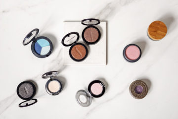
Seven silicone-free eyeshadow formulas (+ swatches!) worth buying