Follow:

    Don’t miss this | Let’s talk alopecia.

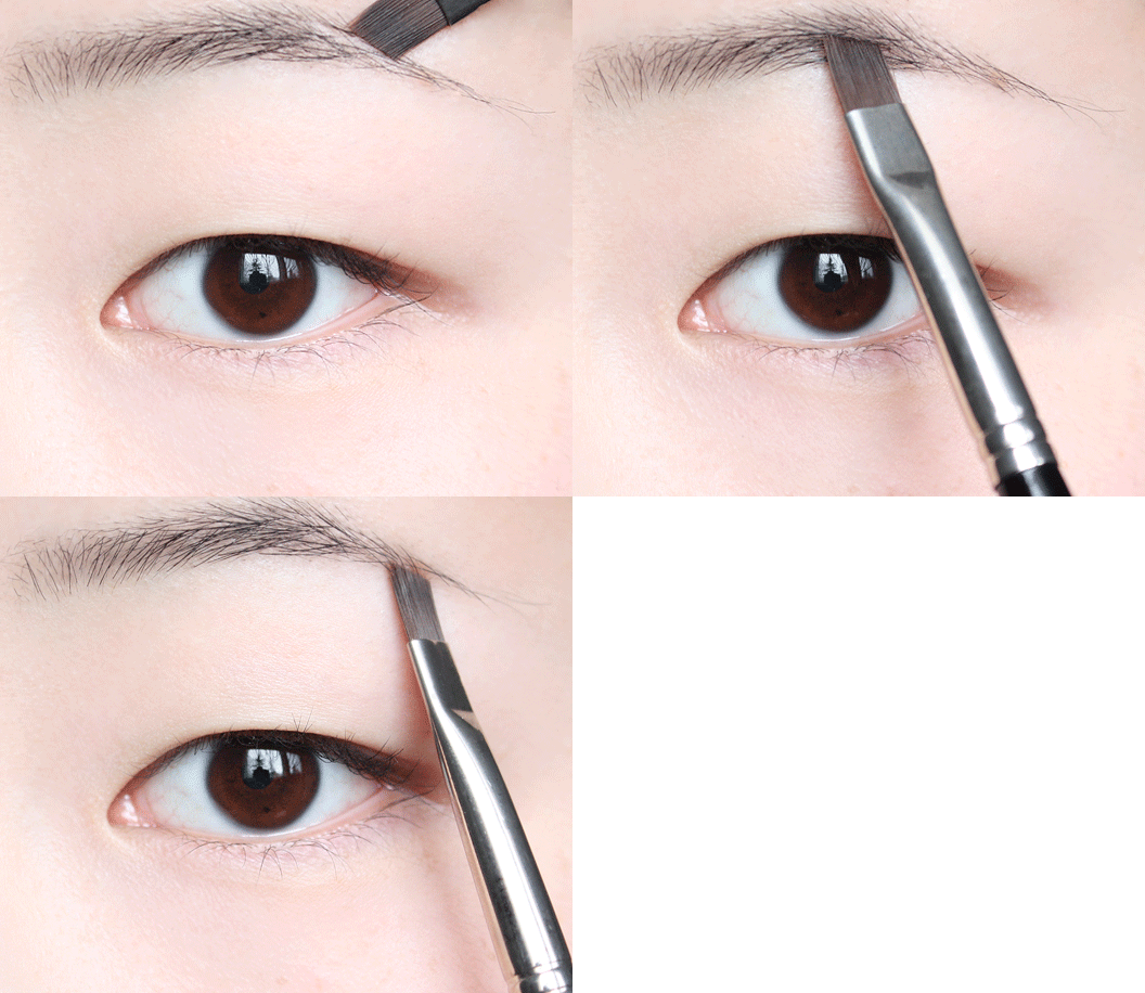
    A ramble/tutorial about hair loss, wigs, and faking it* here.

    Plus, a few gifs (which were turned into PNGs on the She Said Beauty site) –

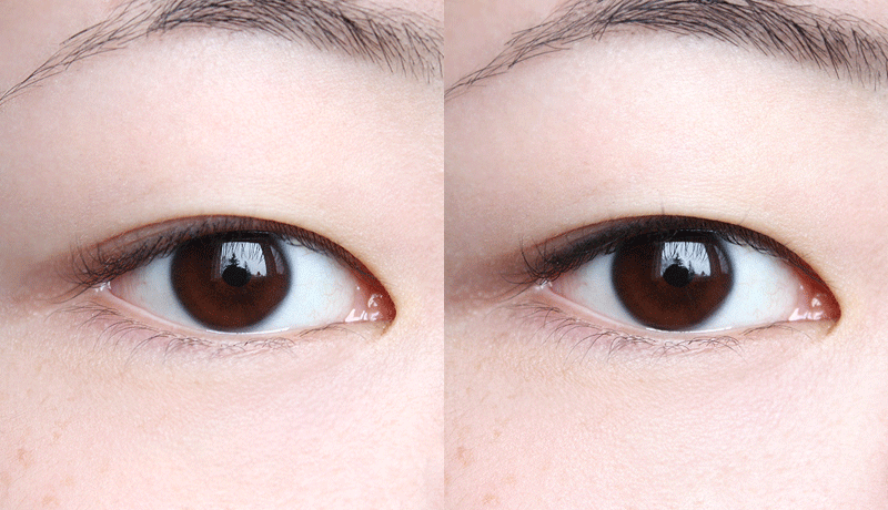
    This last one’s relevant to all of our interests, because (let’s be honest), sparse lashes and brows aren’t just a problem for people on chemo drugs. A before and after with super-natural (supernatural!) brow penciling + black liner in the lash line itself, rather than just above or below it:

    *”It” being lashes and brows, that is. Get your mind out of the gutter.

    Share:

    I was expecting a Reichenbach, but yeah, that works.

    (Just in case we have readers who aren’t caught up with Sherlock – no detailed spoilers in the comments, please!)

    Alright, so this video isn’t makeup-related in the least, but it has absolutely made my week. Give it a watch if you have a moment – it’s not only hilarious, but it’s a wonderful example of viral marketing done absolutely right. Duval Guillaume and TNT, my hat is off to you and your “push to add drama” campaign!

    Share:

    Clinique Quickliner for Eyes Intense: Intense Charcoal, Intense Ivy swatches

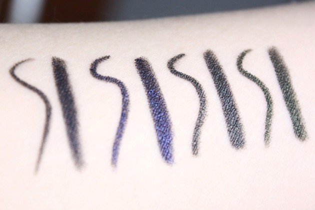
    Despite the rather unfortunate wear time, I’m still a bit head over heels for the gorgeous intensity of the new Clinique Quickliner for Eyes Intense eye pencils. Here are eye swatches and descriptions of Intense Charcoal and Ivy; for Intense Black and Plum, please visit this post instead!

    Swatched L-R: Clinique Quickliner for Eyes Intense in Intense Black, Violet, Charcoal, and Ivy.

    Intense Charcoal

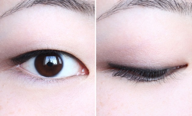
    Used also in this week’s ethereal blue Clarins Colour Breeze makeup look, Intense Charcoal is a dark, gunmetal grey with silver and gold microshimmer. While definitely still dark enough to bring a bit of depth to the lashline, it’s a good deal less sharp than a straight-up black, and it isn’t as obvious as a soft navy – a good choice for a softer, more romantic eye look.

    I have absolutely no idea what else I used in these photos, but I believe a I had outlined a similar eye look to go with the Intense Plum swatch (in part 2 of the review.) Apologies in advance! I rather wish I could remember what I had used on the outer half of the lid, though; I’m rather fond of how it captured on film.

    Clinique Quickliner for Eyes Intense in Intense Charcoal lid swatches

    Wearing Clinique Intense Charcoal

    Intense Ivy

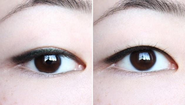
    My current favourite of the range, Intense Ivy is a gorgeous gold-flecked green – darker than olive drab but lighter and more yellow than hunter green. “Ivy” is a fantastic description of the dark olive shade, with its intense pigmentation and yellow tones; it’s a very earthy green, with a rustic feel rather than a synthesized one.

    I can see this working on all skintones, but I think it would be particularly gorgeous on olive complexions.

    Clinique Quickliner for Eyes in Intense Ivy lid swatches

    Wearing Clinique Intense Ivy

    I believe that’s all for the Quickliner for Eyes Intense pencils on theNotice, folks. Hope you enjoyed the coverage! I do plan on doing a comparison with the Quickliner for Eyes (original) range sometime in the near future, though, so keep your eyes peeled for that if you’re interested.

    (And, I suppose: don’t hesitate to give me a sharp jab in the side in a month or so if I seem to have forgotten. Because if that’s the case, I probably have.)

    Share:

    A bit of weekend catch-up

    Just a few follow-up photos to past reviews, today – answers to questions and requests that came to my notice while I was sorting though an old folder of photos.

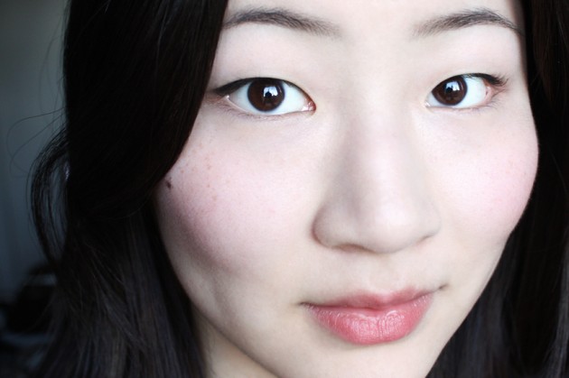
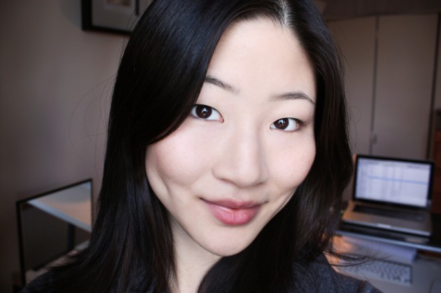
    From late last year: a full-face swatch of MAC Desire, seen also here.

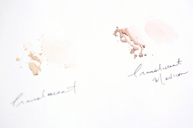
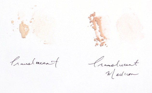
    For a question left on a very old Marcelle review: a comparison of Marcelle’s two loose face powders, Translucent and Translucent Medium. They’re on paper rather than skin for less undertone interference; I hope it helps differentiate between the two!

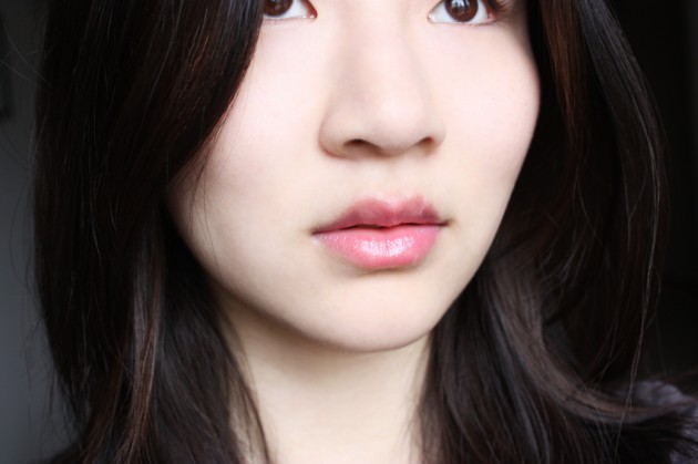
    And, finally, from last month: a full-face swatch of Physician’s Formula’s pH Matchmaster gloss in Light Pink, my current favourite lip product.

    Feel free to add any additional questions or requests in the comments! Additionally, I’m going to go ahead and apologize in advance for next week – posting might get a bit patchy with Winter term finals. theNotice should be back to normal by next weekend, though, so I’ll talk to you then!

    Share:

    Clarins goes soft & blue for Colour Breeze | Clarins Wet & Dry Eye Quartet in Blue Sky review, photos, swatches

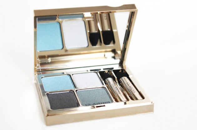
    The product: Clarins Ombre Minérale 4 Couleurs (Wet & Dry Eye Quartet Mineral Palette Long-Lasting) in Blue Sky

    The aesthetic: It feels like the sort of day to start off with the good stuff and work our way down, so I think that’s what I’ll do. The four shades in Blue Sky work brilliantly together, creating a number of gorgeous, soft eye looks with (depending on which shades you use & where) a lovely aqua, charcoal, or teal undercurrent.

    Honestly, I don’t know how they could have done a better job with the colour scheme of this palette. It’s very light, ethereal, and Spring; it feels like a new season without being either bright! bright! bright! or boring pastels. It very much lives up to Clarins’ promise of an ode to lightness, creating a very forgiving, wearable blue eye.
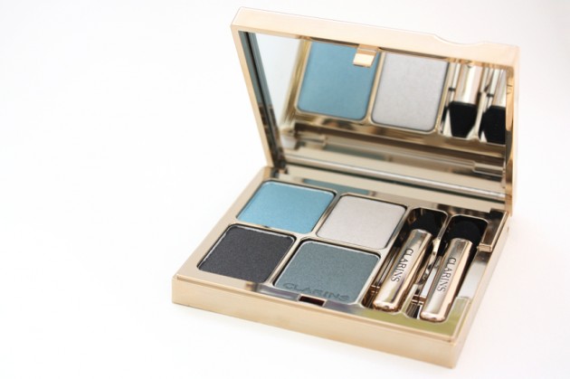
    The shades: Clarins describes the colours in Blue Sky as “subtle-shine shades,” with a silvery turquoise, a greenish grey, a grey eyeliner, and a white illuminator.

    I didn’t love the super-sheer, shimmery white, but I’ll give it a pass, as it’s described as an illuminator. (I think it would make a great inclusion in a palette of mattes or satins, but with three other shimmery shades, I’d have preferred a more opaque off-white illuminating shade). I liked the bright aqua (“silvery turquoise”) more – it has a really lovely, subtle duochrome, the light blue flashing silver when tilted.
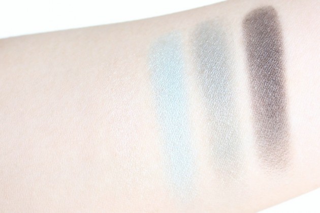
    Clarins Blue Sky Eye Quartet swatches – dry on primed skin

    The darker two shades are my favourites of the palette. The greenish grey (I like to think of it as a desaturated teal) is a gorgeously unique shade; enough grey to make it sophisticated rather than sloppy, but still green enough to add some colour to the eye area. The shimmery charcoal, on the other hand, is intense and sooty (just like a charcoal should be), but with enough finely-milled silver shimmer to keep it interesting rather than just another boring dark grey.

    The illuminator, teal, and charcoal are all shimmery, with particles that (as clichéd as it is) rather twinkle against the skin. The aqua, on the other hand, has that metal-smooth finish that doesn’t sparkle so much as it shifts.
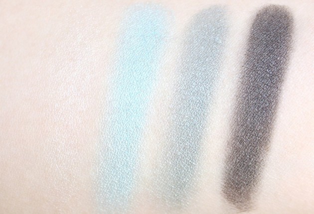
    Clarins Blue Sky quad swatches – foiled on primed skin

    The opacity: Alright, so here’s the catch. With the exception of the charcoal, the shades in Blue Sky range from extremely sheer to fairly sheerwhen applied dry. They’re a good deal more opaque when applied wet (and/or over primer), of course, but I just think they’re too sheer to warrant the price tag.

    The illuminator is excusably translucent, and the dark charcoal is perfectly intense, but the blues (the most important shades in the quad) are a bit lacking. I just can’t get the vividness that I want out of them without foiling, which is extremely frustrating, because I’m crazy about the shades in the pan. Blue Sky is still a good quad (particularly against darker skintones), but it doesn’t quite reach the Clarins standard of excellence. 
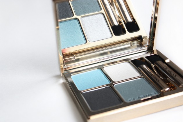
    The verdict?

    As much as I love this quad, I can’t help but feel it’s a tiny bit of a letdown. Of my three Clarins quads (and that’s a whole other can of worms – how do I only have three? How on earth do I manage to talk about them so much if I only have three?), this is my least favourite. The shadows just don’t seem quite as smooth, and (with the exception of the lovely, shimmery charcoal), they’re less pigmented, too.
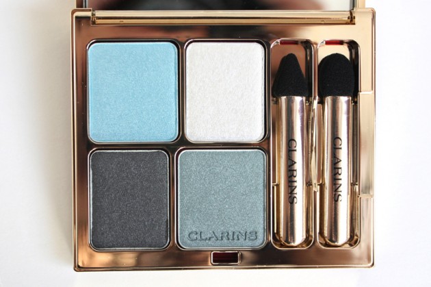
    While I think the colour scheme is spot-on, $42 is a lot to pay when two of the four shades could be better (read: when both the teals should have, in my opinion, been more pigmented).

    Try it if you’re looking for wearable, age-appropriate (all-ages-appropriate) blues. Because, honestly? Aqua is a hard colour for any age to pull off, but Clarins manages to make it totally chic.

    Skip it if you like your shadows to be more than medium-sheer; you only want to pick up one Colour Breeze item (I think this is the weakest product in the collection); or you just want to try out a Clarins quad (again, I think there are better ones).

    With everything said and done, I’d give this quad a very tentative yes. For a quad of blues, just in general, it’s good. For Clarins, however, (a brand that I’m quickly learning to love), I had expected more!

    Keep reading »

    Share:

    Don’t miss this | Metallic green winged liner

    Check out the post here or by clicking on either of the images!

    Products used

    Eyeshadow: Urban Decay Primer Potion, NYX Jumbo Eye Pencil in Milk (base), MAC Matte2 Eye Shadow in Blanc Type (lashline to brow), Smashbox Matte Eyeshadow in Smoke (brows and outer third), Senna Matte Eyeshadow in Fusion (middle of the lid & blended out)

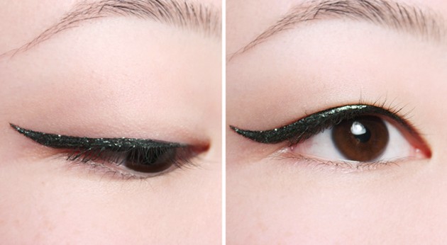
    Eyeliner: Ellis Faas Liquid Eyeliner in Black, Marcelle LUX Metallic Liquid Eyeliner in Jade (layered together)

    Lips: GOSH Velvet Touch Lipstick in Darling (patted on very lightly)

    Cheeks: MAC Powder Blush in Harmony (Matte; to contour)

    Share:

    Eight upcoming launches to get your skin Summer-fresh… before Summer actually shows up.

    While I was going through this week’s launches, I sorted out eight delicious-looking products to feature on their own. Because– well, actually, to be completely honest, I don’t have a very good “because” for this. They were pretty and shiny and nothing this distracting deserves to get lost in a landslide of other products, if you ask me. (I mean – that Dior bronzer, oh my!)

    Anyhow; if you’ve tried anything in the box below, be sure to let us know in the comments! I can’t be the only one whose interest these have piqued, can I?

    Eight Summer-approved bronzers, bases, and primers


    P.S. Yes, I am well aware that I promised Clarins for today. However, instead of being a good little beauty blogging bee and actually writing the post, I spent a good chunk of my evening on an excruciatingly long walk to see if my new sneakers would provide enough support for actual walking.

    Needless to say, they did not.

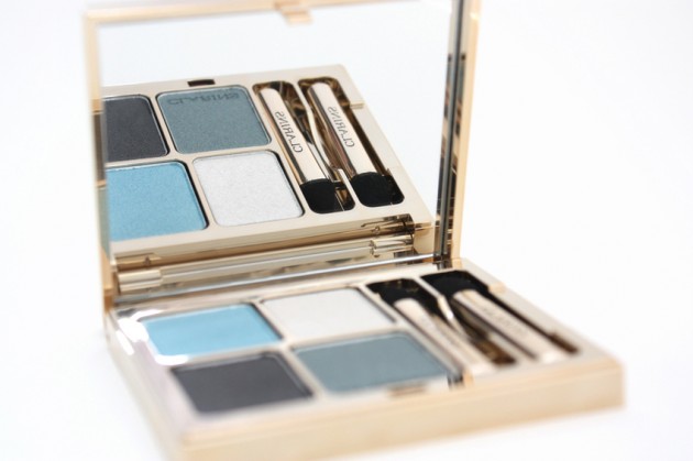
    All that said and done – I will see you soon with the Colour Breeze palette! Here is a teaser photo as evidence of how terribly, terribly sorry I am that I’m taking some painkillers and going to bed instead of attending to your beauty needs ;)

    I’m actually not entirely sure how I feel about the image (it’s horrendously difficult to photograph super-shiny objects, as I’m sure my fellow bloggers will understand), so let me know what you think in the comments!

    Share:

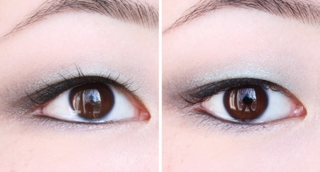
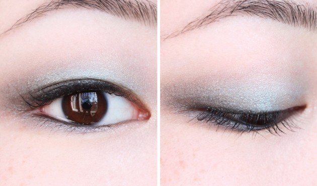
    The hazy, bright blue skies of Spring | Clarins “Blue Sky” Colour Breeze EOTD

    It’s always nice to have a product listing that’s less than fifteen five items long, and I can (blissfully) tell you that the shades in Blue Sky work cohesively enough together that this list is. Aside from the four shades of the quad (LE for this Spring’s Colour Breeze collection), this look features Clinique Quickliner for Eyes Intense in Intense Charcoal, Hard Candy Glamoflauge concealer in Light, and… actually, I’m not quite sure what’s going on with my brows. Smashbox Smoke, probably. Oh! And MAC Blanc Type (Matte2) under the brow and around (but not quite in) the inner corner, of course.

    Pre-emptive apologies for the fact that I didn’t have time for a FOTD! I’ve been up to other things the past few weeks, but I wanted to do a Blue Sky makeup look to go with the review, nonetheless – I always find it useful to see what a palette can actually look like on the lids, so hopefully this’ll help make or break your Colour Breeze lemmings.

    See you tomorrow for a review of the palette itself – swatches & thoughts when it goes up, I promise! For now, you’ll just have to make your judgements based on photos ;)

    Share:

    New 08/04/12

    Despite what Edmonton might think (seriously, I was not expecting last week’s surprise snowfall), Spring is well underway – and the beauty industry’s picking up momentum accordingly on its way to Summer.

    I’m not really seeing anything that really grabs! me–though I’m curious to read some reviews on the new silicone-free Tarte primer; I wonder if it’s just a re-packaging of their original Clean Slate primer?–but a surprising number of products have gone online in the past week alone. Have fun online-window-shopping the new launches, and I hope you’re all having a lovely Easter weekend so far!

    MAC Reel Sexy

    & finally, a few beauty steals to start your week.

    Share: