Follow:

    Frang-what?!

    Alright, so the photos that follow suck. It was dark and my camera wouldn’t focus! I promise it won’t happen again :P

    Anyhow, here’s the ModelCo GLOSSED nourishing body cream. Sent to me in my package from Suzie, ModelCo is an Australian skincare and makeup company, which sells some of its products in Sephora if I’m not mistaken! What I loved: Glossed smells pretty good ^^ It’s a bit strong, so I’d use it sparingly – as a hand cream, or mixed into your regular moisturiser. Which, if you ask me, is a good thing – it’ll really help to cut costs if you’re using 1/3 Glossed and 2/3 regular unscented lotion. I know that not everyone will love the smell (which, according to the ModelCo site, is “frangipani”… which, according to Wikipedia, is a flower.) but I find it quite tolerable!
    What I didn’t love: The price! I wouldn’t buy this for myself – call me cheap, but I refuse to spend that much on a moisturiser, no matter how good it smells. And (more importantly) my arm turned red and blotchy not long after I took these photos. Thank goodness I always patch test my moisturisers! It’s not the first time this has happened (I am, as you all know by now, fairly frangrance-sensitive.)Other stuff: This lotion glitters, like Olay Quench. As I said earlier, it would be great mixed in with another non-glittery cream – without, some might say it’s too sparkly (see the photo above). I’m fine with the amount of glitter in it, though! But I suppose if you’re older, it might seem a little… strange.The verdict? Pass. At $38 for 450mL, this is (quite frankly) a complete and total rip-off. It smells nice and glitters, but that’s a ridiculous amount to be spending on lotion! If you want something that smells amazing, there are a ton and a half of solutions in your drugstore. If you’re searching for something that glitters, go pick up a thing of Quench. And if you seek something that smells like frangipani… don’t talk to me, you garden junkie!

    It’s a great product, but totally not worth the price, especially as I’m allergic to it!

    Share:

    And all was well in the world

    My favourite lip liner, currently, is Victoria’s Secret “Sizzle” – a dark burgundy red, that unlike most reds, doesn’t pull very yellow on me.

    It’s the most gorgeously creamy liner you will ever try, I kid you not! Packaged in an automatic tube, there’s no sharpening required, and a tip that is always small. It’s seriously heaven in pencil form.
    But then I found out that, of course, it had been discontinued a while back. This is a story that is all too familiar with me, for all my holy grail products. But then, swatching a couple other liners in the back of my drawer, I found an almost perfect dupe! It’s non-automatic, less creamy, and a hair off – but it’s close enough and looks the same on my lips.

    What is this mysterious shade, you ask? Burgundy, by MAC! Go try it on – this one hasn’t been discontinued (tch. Yet.)

    Share:

    I once heard a girl try to pronounce it "dew-bonnet"…

    Product: MAC Dubonnet Amplified lipstick. Shade: I thought this was still a touch too orange-fire-engine red for me, but I do quite like it. It makes a gorgeous stain, and is a fairly versitile colour! I can see this working on a lot of ladies, and though it isn’t OH MY GOD HOLY GRAIL (ha, the first time I wrote “holy grill”… um, no.) it is quite nice and I do get compliments when wearing it.And I promise it’s not just because they’re afraid I’m a tranny that’s going to beat ’em up.

    This swatch is too blue to be true to colour (the lip swatches are closer, though they’re a little too blue too), but here it is anyways:
    Other stuff: I love the vanilla smell of MAC lipsticks, and I love the B2M program. And how easy it is to find MAC! I can think of at least five counters or freestanding MAC stores within forty-five minutes of me, which definitely gets points for convenience. However, I’m not feeling the Amplified formula – it’s too drying for my super-dry lips, if you know what I mean! But I think it would be fine for most people.

    Need help finding a liner? I swatched a bunch with it – it’s on unlined, unprimed lips for the swatch photo (as always!) but I do like wearing a liner when I’m going out. (Acutally, most days I only wear liner. But whatever.)

    The shade I found to be closest to Dubonnet was MAC Burgundy, but I usually layer my Victoria’s Secret Sizzle liner under it for a little more depth – remember, ladies! Don’t line your lips, fill them in by creating a precise line, then forming a gradient to the centre of your lips. Would you only ice the outer edge of a cupcake?! No. No you wouldn’t.
    MQ: MAC Quartz MC: MAC Cranberry
    MB: MAC Burgundy

    VS: Victoria’s Secret Sizzle CC: Cargo Berry (why the hell is that a CC?!)

    The Verdict: As long as you don’t have super-dry lips like me (I know, shame shame) this is a great lipstick. Just like any other one, though, I’d check it out in-store first! I wish it was a little more blue-based, but I’m very particular about my reds – I still haven’t found the perfect one, and I’ve been searching for over a year!

    Share:

    One piece. Infinite possibilities.

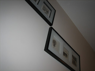
    The above piece is $10 from IKEA. They’ve got a ton of gorgeous prints for fabulous prices – a lot for under $20, and lovely cheap frames to go with them (they have a lot of more expensive prints as well, but those are more of freaking-huge-on-canvas ones). This one comes in four different prints online, but I’ve seen more in stores (including the one I have here)

    What I love about this is that it has a shadow-box style frame; the picture is about an inch and half from the glass.

    For $10, I bought two – one to put my own prints in (above.) I had three prints (well, these ones are little paintings, but whatever) that I picked up in China. I knew I wanted to put them in one three-frame, but couldn’t find the right one at the right price.

    What we(mum and I) did. All you need is a frame, artwork, a pair of pliers, and a hammer!:

    1. First, we found the cheap frame. Then, because we’re not thieves, we bought it.
    2. Next, we took needle-nose pliers and pulled out the staples holding the backboard on (carefully!)
    3. We cut the posterboard to size, positioned the three pieces of artwork on it, and taped them in from the back using double-sided tape.
    4. Put the posterboard-backing in, and replace the back panel.
    5. Hammer in the nails that you pulled out earlier. No need for new materials – we just put them back in their holes. One or two got mangled coming out, but there were so many excessive ones that it didn’t matter!

    $11 (the posterboard was a dollar, lol!) and a half hour later, I had the photos mounted on black posterboard and in the frame. And I kept the other one as it was… the prints were too pretty not to have in my room!

    Share:

    Get wild

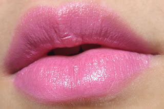
    Product: WildShine, which idiotically does not have the company listed on the tube. Anywhere. But it’s by Wet ‘n Wild, current tsar of cheap-but-effective drugstore goodness. The shade? Passionate, a bright hot pink/fuchsia.

    Ahhh why is this photo so dark?!


    Texture and smell:
    As with most drugstore lipsticks, this doesn’t have the most “luxe” scent – it’s rather crayon-y, if you can imagine that! But more “scent-free” than “ohmygod nausea”, which is a nice change from the usually putrid lipstick bullets you pick up at the drugstore.

    As for the texture, though, this feels like a gloss. A glorious, non-sticky gloss!! But as always, the exchange is texture for staying power. Though it feels glorious, it’s this very aspect that will have it melting off your lips in no time.Packaging: cheap. And not “normal cheap, because it’s from a drugstore”, but cheap. The product sticks out an inch above the tube when you buy it, and it’s hell to put the cap (which is very loose) back on when you’re trying not to hit it!! I’m tempted to just cut off the first inch, so I can roll it back more easily. I do like the slim tube, though. It’s a little more fun, and allows for a little (TINY BIT) more precision.

    But all of this is irrelevant. With such a bold shade, what’s important isn’t what’s in the tube – it’s what’s on your lips. So here are some photos of it, right on my lips with no base or lip liner:Hey look, the shadow of my nose!
    [not an alien]

    And here are photos of it on top of concealer – BAM!
    The verdict? I think this line would have great YLBB shades, but I woudn’t wear such a bold colour in this formula. The “why” is simple: though it is gorgeous and unexpectedly pigmented, I think the super-slippery texture would turn you into a hot mess in no time flat.

    But hey! If you’re okay with not applying over concealer for that extra “bam!” or using super-bold shades, I think these would work well for you – espeically for drugstore price. After all, they do feel fantastic!

    Share:

    Squeaky clean, no soap or sink required.

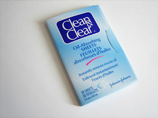
    Product: Clean and Clear Oil Absorbing Sheets

    The Rundown: Though they’re not the most glamorous, they’re a) cheap, and b) easily accessible! You can pick ’em up at any drugstore – I always check to see if they’re on sale, and stock up when they are. These ones are the original format, but they come in a few snazzy scents now, too.

    A clean sheet… boring much?

    Effectiveness: Unlike some tissues, these are soft and filmy – meaning that when you pull it across your face, you not only pick up all the oil, you also don’t smear your makeup! Once the oil is in the tissue, it turns a dark, translucent blue, so you know when a sheet is used up. And it seems to be “trapped”: it’s not going to come off that sheet, don’t worry! I use one of these a week, with touchups once a day at lunch, but someone with oilier skin (like my sister) can go through two or three of these a day.

    Used – you can see where it’s captured oil!


    And up to the light, to show its translucence.


    The verdict? Buy it if you’re looking for a great blotting tissue! It definitely does what it’s supposed to, and it does so very well. I’d like to try out some others, but I keep forgetting to grab some when I go to Sephora! Those that I have tried (not many) have been more expensive and less effective, though.

    Share:

    And puppy dog’s tails

    Product: MAC’s 225 blending brush (?)

    What I use it for: blending colours all over my lid, and for – surprise! – contouring my nose.
    Loves: This makes a great detail face contour brush, for areas like your nose and under your lower lip. It’s pretty darn soft, and the bristles are dense but soft, just as they should be in a blending brush!

    Dislikes: I don’t love the size of this brush; unless you’re trying to blend all the products on your lid together to form one big glob, you’ll have to be super-careful. But as long as you are careful, or if you’re trying to get a gradient effect, it’ll be great!The Verdict? This brush has been discontinued, which I think was a good thing. It’s nice, but by no means is it a must-have. Which is why this review was so short! Why waste my time reviewing something you’d have to hunt down, but isn’t worth hunting down?

    Share:

    How many languages do you speak?

    Hopefully, in a few weeks, I’ll be able to say “two, fluently!” I know a lot of you ladies probably have multiple languages, so I’d love to hear what they are!

    [And no, I don’t speak Chinese. I’m so damn tired of people asking me a)CAN YOU TRANSLATE THIS?! and b)WHY DON’T YOU SPEAK CHINESE?!, always in tones LIKE THIS — clearly — because they are a)ignorant, or b)annoying.

    I am Canadian. And that is what I speak. Now stuff it, jerks.]

    Share:
    16 Comments

    Gold/purple tutorial

    I did a quick tutorial for yesterday’s look – on my eye, though, not on mum’s! I didn’t want to make her sit through all the photos etc.

    You can do this in a simple three-step method, so stick around or scroll down. We’ll go over the materials/products first.

    The materials:

    I always do intersecting swatches to see which bases to pair with my shadows, and I thought you guys might like to see them! Bases are the one thing I cannot stress enough – they make a huge difference on the outcome of your look! I love mixing and matching products. It not only helps with staying powder, but it also amps up the vibrancy a TON!

    Purples —
    I ended up choosing Senna Twilight mixed with Korres Plum overtop of Smashbox Smashing Mystic jumbo pencil fort his look, though in real life I would have just used Twilight. (It doesn’t show up as well on camera as it did in real life!)


    Golds —
    Man, these were SO different over a base! Some of them turned orange, others brown… and one, the perfect shade of gold! I went with the Victoria’s Secret Mosaic Moss palette, which contains a gold shade. In real life, I’d layer it over Benefit Gilded, but for the photos, I chose Smashbox Smashing Velvet jumbo pencil as my base.

    The steps:
    1. Apply a base. Messiness doesn’t matter! Use a synthetic concealer/cream product brush or your finger to “pat” the product into itself, the other shade, and your lid. Don’t rub; this will only rub the product off.
    2. Apply corresponding shadows overtop.
    3. Blend. I know this looks more subdued in the photos than step #2, but I’m not quite sure why. In real life, the transition between 2 and 3 is definitely necessary and is conducive to a cleaner look! Get rid of all those harsh lines.
    That’s it!
    Line and apply mascara if you wish; I didn’t bother, as I knew I wouldn’t be wearing this out of the house.

    Share:

    One look, two different lid types

    I tried something different today: instead of just using an eye look as inspiration, I decided to do it on my monolid, and then use the same look for double (normal) lids! It was definitely fun, and not nearly as difficult as I thought it would be (as this one’s vertically, not horizontally, blended.) Tutorial here.

    The promo that inspired the look:I know that my camera white balances very warm/bronze in DIRECT-direct sunlight (as in, oh-g0d-my-eyes-are-burning sunlight), and I wanted that bronzed look to match the promo – so I took the finished photos in this lighting!

    Here’s my mum’s eye to start with. I did mine first, and hers about two hours later, so it was dark by the time we finished hers! I had to bump the ISO to 400 in order to get a clear image, so please excuse the noise! I really loved how her eye looked very purple from one side, and very gold from the other!
    For the record, she’d never wear something like this out of the house – nor would I force her to! I know she isn’t the optimal age for this look, but she’s the only double lid I have easy access to, so dammit, I will take advantage of that fact! :P


    And, finally, here’s my eye:

    Hope you enjoyed the post! I had SO much fun doing a similar look on a monolid and a double lid – it was definitely fun making tiny alterations for the different lid types!

    Share: