


The product: Guerlain Abeille Royale Eye R Repair Serum
I’ve waffled around eye creams for a long time. It’s a tricky situation: you really want something that works, but many doctors and derms don’t actually agree that any of them can possibly work. An eye cream, even one as good as the one featured in this Guerlain Abeille Royale Serum review, can’t do what fillers and eye lifts can—even one that’s $155 CAD.
Regardless, I swear that some of my eye creams and serum do work. Sure, maybe they can’t do as much as injectables and lifts can, but as I rapidly approach thirty… I’ll take every little bit of help I can get.

Guerlain Abeille Royale Serum review: The promise
Guerlain loves its bees — and I love that it does. The brand’s main charitable focus centres on making sure the world will have bees for years to come, and it’s a symbiotic relationship that I can get behind. From donations to the Ouessant Island Brittany Black Bee Conservatory (ACANB) to something that, I kid you not, is called Bee School, they’re committed to their apiculturist roots.
The world needs bees, and luckily for us, so does Guerlain.
The Guerlain Abeille Royale Eye R Repair Serum uses amino acid-rich Black Bee honey paired with royal jelly to nourish and tighten the thin skin under your eyes, with the promise of a brighter, less puffy eye area. It features a silicone-free formula that’s composed of 94% natural/naturally-derived ingredients, and comes with a beautiful Gold Drop applicator.

What made me love the Guerlain Abeille Royale Serum
Okay: the formula is good, the texture is amazing, and the scent is heavenly.
But none of that is why I love the Guerlain Abeille Royale Eye R Repair Serum so much.
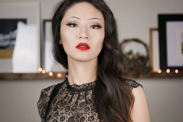
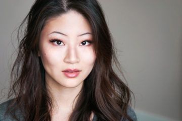
What takes this eye serum to the next level is ✨the shimmer✨. The shimmer on this product is unreal. I’ve tried dozens of shimmery eye creams, and likely hundreds more tinted moisturizers, luminizers, and shimmery bases… but this tops them all.
The effect truly cannot be photographed, and I will not try. You’re just going to have to trust me on this. I like to apply this on no-makeup days, pressing it all around my eye area and upper cheekbones, or I’ll do a double dose when I’m wearing concealer: eye serum, moisturizer, let them sink in; then, concealer/foundation, powder, and a sparing layer of eye cream to finish the look.

The Guerlain Abeille Royale Serum review verdict?
I could not be more pleased to be doing a Guerlain Abeille Royale review, because it introduced me to my new favourite way to make my eyes look bright: simply make my cheekbones look so ungodly high and glowy that no one noticed my dark circles.
My verdict on this one? Get it. If you can afford it as a treat, it makes a phenomenal addition to your skincare and makeup regimen.
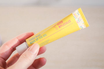
(If you cannot afford it as a treat, the Good Molecules Yerba Mate Eye Gel is also very good. You’ll have to supply your own glow for that one, however, as well as your own cheekbones.)
Availability: $155 CAD/$130 USD at Nordstrom, Sephora, and Selfridges. Permanent.
—
Disclaimer: The product(s) mentioned in this review were supplied by the brand. This post contains affiliate links and a whole lot of cheekbone-lifting goodness.