Follow:

    Matchmaker, Matchmaker, I’ll bring the veil | Physicians Formula pH Matchmaker Blush in Natural: review, photos, swatches

    The product: Physicians Formula pH Matchmaker pH Powered Blush in Natural

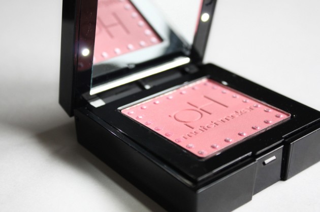
    The blush: This review goes into some pretty dark (read: critical) places, so I thought we’d start off on a bright note: the blush itself. I find I’m always nicely surprised by Physicians Formula products, and this one’s no exception.

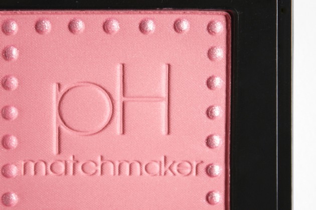
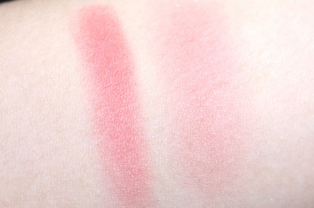
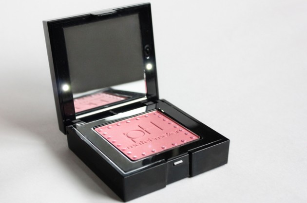
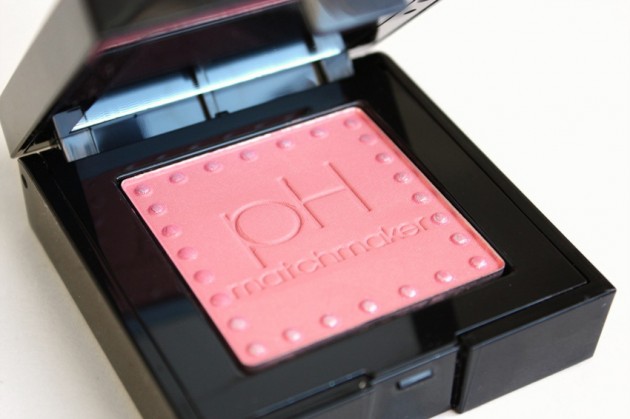
    For a shade called Natural, this blush is actually quite rosy. It’s a bright, warm medium-pink with a bit of shimmer; the chunky silver overspray on the dots wears off, but–despite what the internet may tell you–the blush itself does have some finely-milled shimmer as well.

    (It’s possible that the overspray is just extremely reluctant to leave, but I really doubt it, seeing as some of the shimmer is fuchsia.)

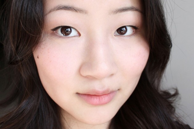
    Anyhow; the super-tiny silver and fuchsia reflects are visible mainly in the pan, but do make an appearance on the cheeks if you look closely. The blush itself is more than decently pigmented for a drugstore product, and should work just fine on most light, medium, and medium-dark skintones, though I’m guessing it’ll really shine on warm and olive skintones, specifically.

    As the cherry on top, this blendable blusher layers well, too, so you can wear just a light dusting of powder for a really fresh, glowy look, or blend in a bit more for a full-on flush.

    The packaging: Oh, pH Matchmaker products, you kill me. While I’ve been loving the blush itself, this packaging is way more clunky than it needs to be! The lid itself is the height of an entire Senna blusher, and it’s only a third of the height of the whole contraption.

    In theory, I’m actually okay with this packaging. An LED-lit mirror and a cute brush tucked under the blush… it sounds good, right? But the thing is, the LEDs aren’t bright enough to apply blush by, and (after having them on for about ten minutes to photograph,) they’ve already burned out.

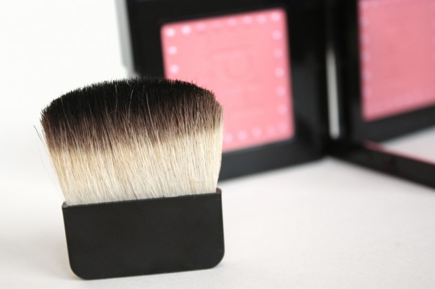
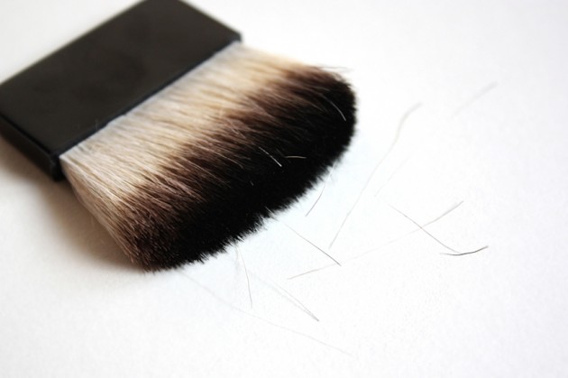
    And then there’s the brush. I actually like thin brushes for certain products, and this one’s included in that statement — the blush itself is more than decently pigmented, and a thin, flat brush is a great way to get just a small amount of product at a time.

    This brush, though? It sheds like crazy, which is always a pain, and after just a few weeks, it’s already starting to feel floppy and sparse as a result.

    The kitsch: I’m not crazy about this whole “pH powered!” concept that Physicians Formula has going on, either. Photochromic powders, okay, kind of cool — having your blush look the same both indoors and outdoors is definitely a plus. (If it works, that is; I haven’t tested. I’m not even sure how I would, to be honest.)

    pH-adjusting fluorescein-based dyes, though? Um, fluoresceins are typically involved in like, microscopy and blood stain detection, neither of which are particularly appealing concepts to your average consumer. Plus, acidity-fitted colour cosmetics don’t actually make sense — I mean, I could be an NW30 with a skin pH of 5.3, or I could be an NC15 (actually, I think I am; I can never remember) with the same skin pH.

    The verdict?

    Despite the fact that the last… five paragraphs solid were rife with criticism, I’m actually pretty fond of this blush. The packaging and marketing are awful, as far as I’m concerned, but the product itself — it’s worth a second look. It’s quite pigmented, really blendable, and the shimmer is surprisingly finely-milled, particularly for a drugstore product.

    That said, I wouldn’t pay $15.99 for something this clunky. If you can find the pH Matchmaster blushers at 20-40% off, which Physicians Formula often is at Shopper’s or Rexall, then definitely pick one up; at full price, though, I think this one’s a pass.
    Keep reading! »

    Share:

    Don’t miss this | A soft, effortless Spring look

    I’ve been doing about a look a week the last little while, but most of them have been for the purpose of, well, the look. Which is to say, the concept of the makeup came first, and was then followed by the selection of products — which is how things usually go, if I’m not mistaken.

    This week, though, I set out with only two things in mind: one, create something that would more or less realize the idea of a staple Spring makeup look, and two, feature a number of the products I’ve reviewed recently, so that you lot can see what they look like in an actual look, instead of just on my arms.

    You can read the She Said Beauty post here, but just keep on scrolling if it’s the product babbling (and not the tutorial) you’re here for.

    (Note: all the product links in this post go to reviews on theNotice!)

    The cheeks

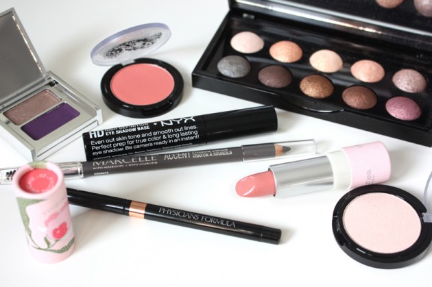
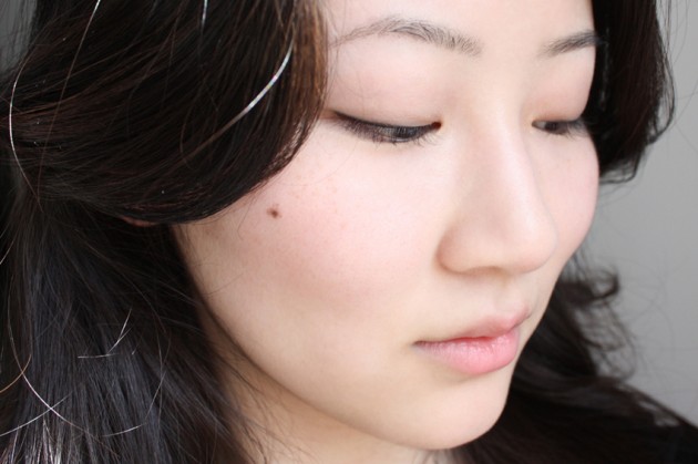
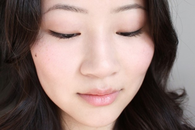
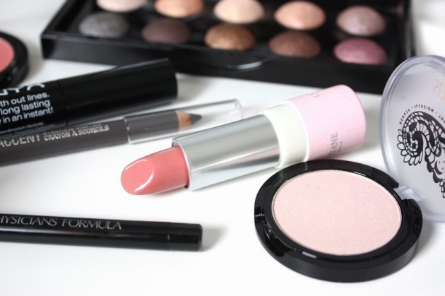
    Ah, Senna. Quite a few comments were left asking to see these on my cheeks, and I’ve been using them in various FOTD photo sets since they came across my desk. This look happens to include the Senna Sheer Face Color Powder Blush in Clarity and Face and Eye Color in Enlighten, as blush and highlight, respectively.

    I’ve been using the two Senna blushers (not including, of course, the hilighter) for a good few weeks now, and I have to say — not loving them any less, even after all this time. I thought some of their appeal might wear off, as it does, but Senna products tend to stick around for me. What can I say? The colours are just that good!

    (Or my frontal lobe is just that fixated; really, it’s a toss-up between the two.)

    The eyes

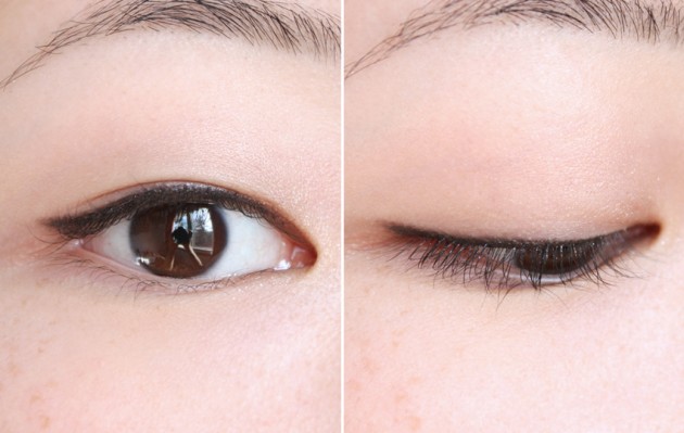
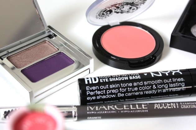
    To start, I used Vasanti Mount Rushmore through the whole lid – just the shimmery taupe, though, mind. For a touch more definition, I added a few of the Sephora Moonshadow In the Light shadows; lighter in the inner corner and a hint darker on the outer third.

    Then, to finish things up, I added two pencils to the look. First, the black eyeliner from Physician’s Formula Shimmer Strips in Nude Eyes along the upper lashline — I’ve yet to review this eyeliner trio, but I keep reaching for the black. It’s got a bit of shimmer in it, which makes it a bit more interesting than a solid black).

    And, finally, a whisper of Marcelle Accent Brow Pencil in Granite through the brows. I’m not crazy about Granite, but it’ll do, you know? I tend to fill my brows sort of (okay, extremely) lightly, so it doesn’t really matter what I use as long as it’s sheer and grey(ish).

    I know I’ve mentioned this before, but: grey eyebrow products really do work wonders for cool skintones + black hair! It’s a makeup secret ;)

    The lips

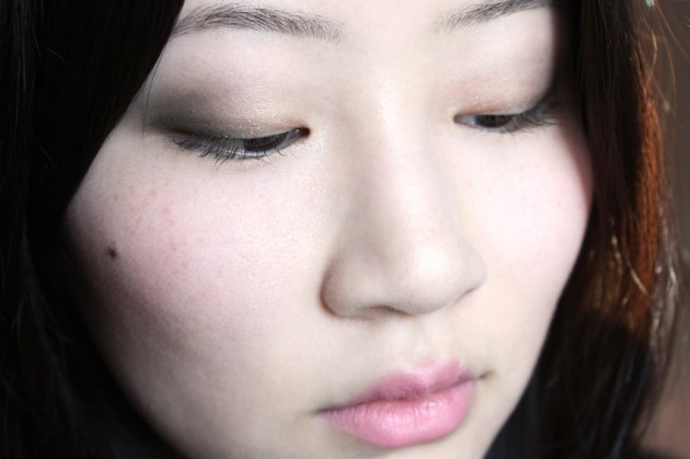
    Last but not least, two products from a little farther back: L’Occitane Lipstick in Pivoine Délicate and L’Occitane Lipgloss in Rose Frémissant. I photographed this look with both lips; though it’s a small change, I couldn’t decide if I preferred the bare look of the lipstick or the light, playful edge that the gloss gives.

    Anyhow; the photo above is the only one with the gloss layered on top. Feel free to decide which version you prefer on your own, because I haven’t any help to give!

    Share:

    A little bit sweet on you | Clarins Colour Quench Lip Balm in Sweet Papaya review, photos, swatches

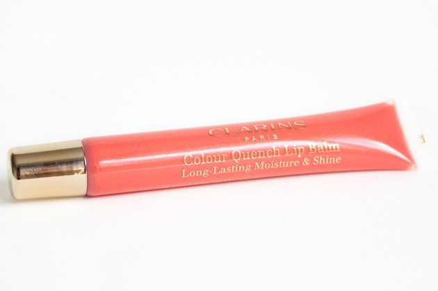
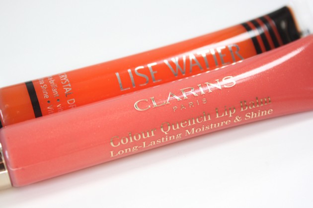
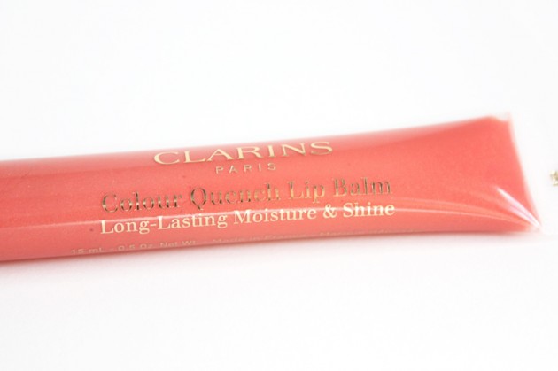
    The product: Clarins Colour Quench Lip Balm in 06 Sweet Papaya

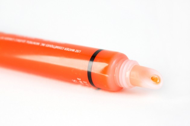
    After last Friday’s Lise Watier Tangerine review, I pulled Sweet Papya from my drawers for a quick comparison. Save for the fact the slim, slant-tip packaging and the fact that they’re both somewhere in the vicinity of “orange,” the two shades aren’t all that similar – but that’s reason enough to see how they measure up, if you ask me.

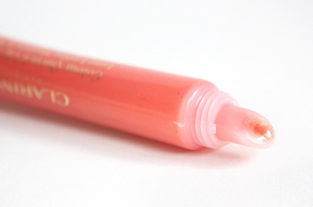
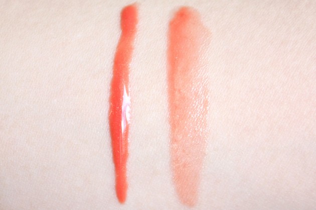
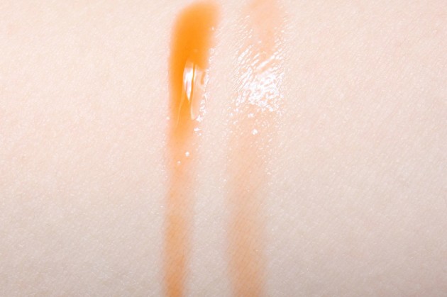
    The shade: While Tangerine is a bright, clear orange heavy yellow undertones, Sweet Papaya is a slightly milky red-orange with finely-milled gold shimmer – enough so that, while there is plenty of shimmer, it’s hard to discern once on the lips both visually and tactually.

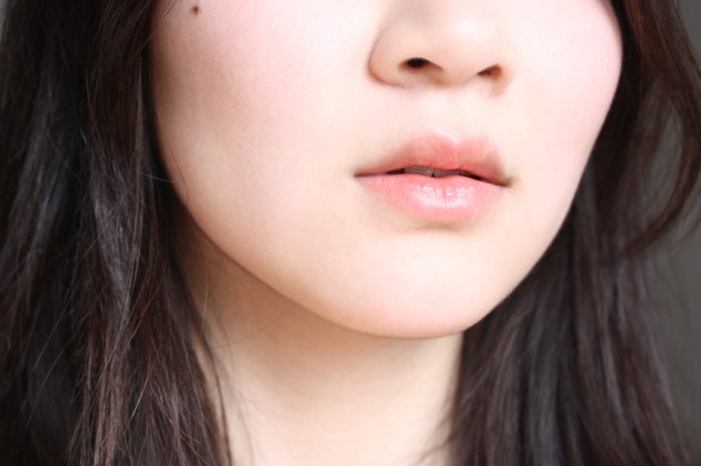
    What makes it worth talking about now, though, is the opacity. It’s still sheer, but while the “translucent” Tangerine was really just clear, Clarins’ product actually fits the bill for translucent. It won’t give you bright, defined lips, but it’s just tinted enough to deliver a sheer layer of colour and shimmer. 

    “Papaya orange” is an iteration of the colour family that I feel like I don’t see very often in lip glosses or balms, but I actually really like it. At this level of pigmentation, the different hue doesn’t make an enormous difference, but it’s a great alternative if you want a more demure version of the orange colour family.

    The scent: One of the main reasons why I wasn’t crazy about Tangerine was strong floral scent – it’s a dead ringer for a bouquet of lilies, a scent that would theoretically be fine, but which I’m not actually fond of. At all. (I don’t know; maybe it’ll grow on me?) I typically enjoy the fragrances of Clarins products, though, and the Colour Quench balms are no exception.

    Sweet Papaya smells sweet and fruity (I’ve seen it described as a light cherry fragrance), and while it’s not my favourite scent, it’s not too cloying — more like you’ve just eaten a few sweets than like you’ve been frontally assaulted by an angry swarm of chemicals.

    The formula: Sort of like the shade, the Colour Quench formula isn’t one of my favourites – but I still do like it. I’d have liked to see it marketed as a sheer lipgloss rather than a long-lasting lip balm, though, because it fits the bill for a good gloss. While not stripping, I don’t find this formula particularly hydrating, but it is both non-sticky and shiny.
    If you pick up a Colour Quench balm, go into it expecting a comfortable, sheer, fun summer gloss, rather than a super-hydrating, long-wearing balm.

    The verdict

    Sweet Papaya isn’t a must-have in my books, but if I absolutely had to wear a sheer orange shade, it would probably be my top pick. I really like that Clarins has gone with a red-based, papaya-inspired shade rather than an orange or tangerine one, because (with fair olive skin and cool undertones,) it makes the orange hue easy to wear.

    As I mentioned earlier, though, I think calling this a “Colour Quench Lip Balm” that will deliver “long-lasting moisture & shine” really misconstrues the product. Think of it as a sheer, comfortable gloss, and you won’t be disappointed; expect a hydrating, long-wearing lip balm, and you probably will be.

    Keep reading! Ingredients, additional photos, & more »

    Share:

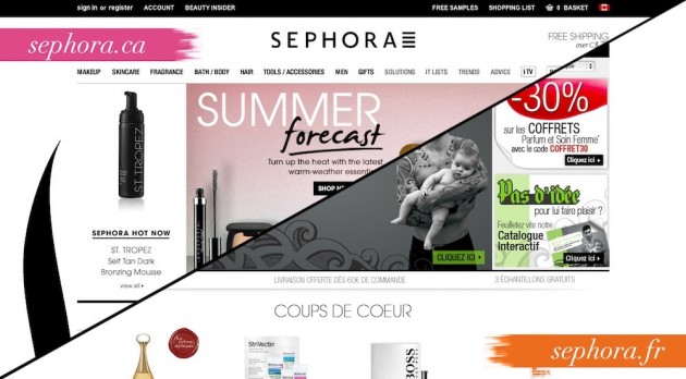
    Sunday in France: a brief foray into the magical world of Sephora.fr

    Instead of the usual “New…” widget, I thought I’d do something a bit different this Sunday – a glance at a few new products in French Sephora stores, with a bit of babble about the site (and beauty market) enjoyed by our beauty-addict counterparts over there.

    I have a soft spot for the Sephora.fr online shop, even more so now than I did a few months ago. Once the newness of the Sephora.com revamp wore off, I found that I… don’t really like it, to be honest. I’m quite fond of the aesthetic, but I’m a lot less crazy about the actual functionality. (That said, though; the Canada/US site has ingredients listed for more of the products, and I wouldn’t give that up for the world.)

    The brands

    As could be expected, Sephora shops in France carry a different product range than those in North America — more skincare, more fragrance; less makeup. They carry different brands, at times, too: they get Chanel, Serge Lutens, and La Prairie, for instance, (those lucky dogs), but miss out on Korres, Fresh, and a number of our newer brands, like Ellis Faas or Edward Bess.
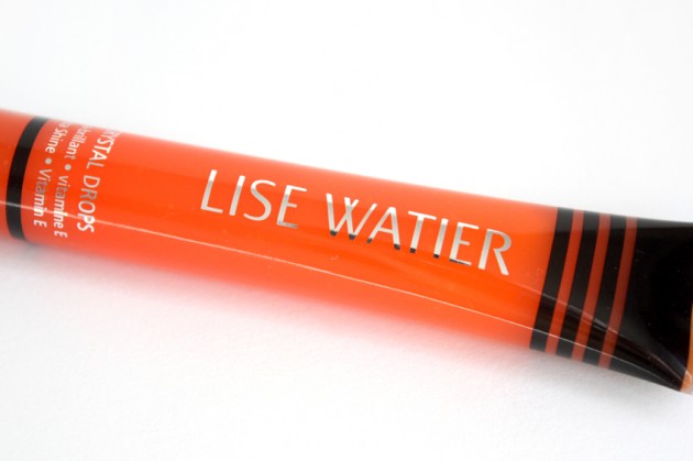
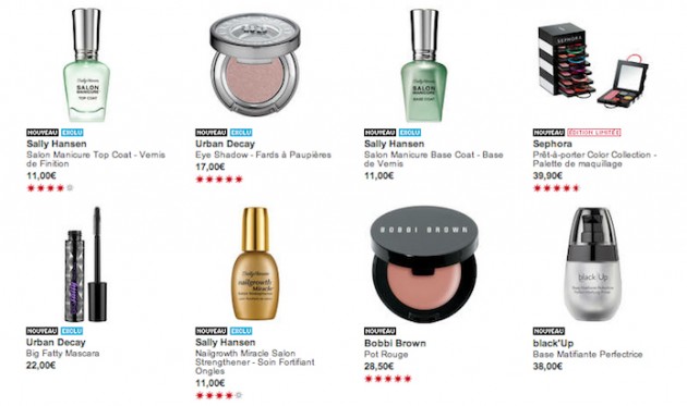
    Strangely enough, I spied a few North American drugstore brands on the French site; Sally Hansen and Hawaiian Tropic intermingled amongst the expensive skincare and impressive fragrance ranges.
    The addiction

    The last time I went through the Sephora.fr site this thoroughly (I think it was about a year ago), I noticed that they had a bit of an obsession with travelling beauty products. It wasn’t just a passing fancy, though, apparently, because there’s still a small-but-highly-visible section on airplane-appropriate products!

    (I don’t know why, but I find that absolutely hilarious. I’m aware that, objectively, it isn’t funny at all. It doesn’t really seem to be making any difference in my reaction, though.)

    The bestsellers

    Of course, you can’t have a post about a foreign beauty site without going over the country’s bestsellers list. In France, 12 of the top 20 bestsellers are skincare, 3 are makeup, and 5 are fragrance; in Canada, only 8 are skincare, with 9 being makeup, and 3 being fragrance.

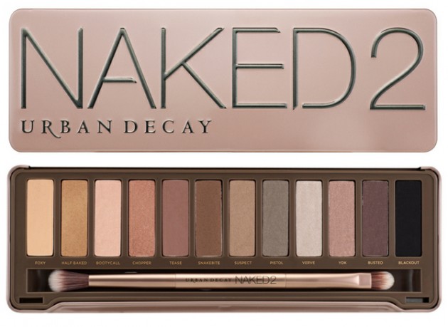
    If you look at the products themselves, things get even more interesting. French women tend to focus their makeup purchases on mascara, while Canadians buy more base products. (Hey, maybe that focus on skincare is paying off, after all!) The Urban Decay Naked 2 palette is the only bestselling product the two sites have in common.

    In skincare, the Clinique Even Better Clinical Dark Spot Corrector is the only product to grace both bestseller lists. The Sephora.fr list is dominated by Clarins (which, as we all know, I have a soft spot a mile wide for), but the brand doesn’t appear in Canada’s top 20 at all. We’re apparently just running around buying tinted moisturizers and BB creams like crazy at the moment, apparently, which–I cannot tell a lie–actually sounds pretty accurate.

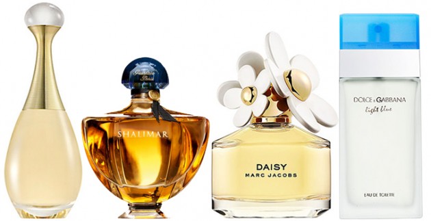
    Different, too, are our tastes in fragrance – I’d say the French have more refined olfactory palettes, but that wouldn’t explain how (or why, or what?!) a Hello Kitty EdT made it onto their bestseller list and Balenciaga Paris didn’t. Again, there was only one product in common between the lists: the ever-classic Dior J’Adore. (Don’t you just love it when patterns keep up being all pattern-y?)

    And, finally, the reason why I was nosing around Sephora.fr to begin with:

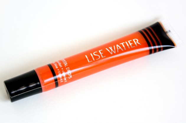
    They’re just so cute! {1} {2} {3}

    Share:

    A crystal I’d probably be okay with dropping | Lise Watier Crystal Drops Lip Gloss in Tangerine: review, photos, swatches

    The product: Lise Watier Crystal Drops Ultra-Shine Lip Gloss in Tangerine 

    [ Psst: I haven’t worn this one around a ton because I’m not crazy about orange, so this is going to be more of a “flash review” than a full-blown production. If you have any questions about the product that aren’t answered in this post, please feel free to ask them in the comments! ]

    Lise Watier call their Crystal Drops formula a “wet look” lip gloss, made to “[bathe] lips in a translucent, glistening, ultra-shine.” They note that the glosses are non-sticky and won’t run, and the Drops come in three shades this summer: Tangerine (photographed here), Smoothie (a shimmering nude pink, and Dragon Fruit (a bright, punchy pink).

    Lise Watier  Crystal Drops Lip Gloss in Tangerine – swatch

    Lise Watier Tangerine lip swatch

    This Crystal Drops lipgloss has a light floral fragrance that lingers; a negative in my books, but a plus in many others, I’m sure. The shade and shine, though, didn’t blow me away: Tangerine is super-sheer, almost more clear than translucent. And, while, I can definitely get it to deliver on the “wet-look” claims, I find I have to apply quite a bit to go from “shiny” to “ultra-shiny.”

    It’s more of a… regular shine. An okay-shiny lipgloss.

    Keep reading! »

    Share:

    Don’t miss this » Jessica Chastain Cannes 2012-inspired makeup

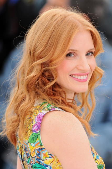
    Okay, so this isn’t the look that I’m dying to share with you (that one should be up soon, though; maybe next week?) but it’s a look nonetheless! I did a green-and-gold tutorial for She Said Beauty this week, inspired by the image below of Jessica Chastain at this year’s Cannes festival. It… well, to be totally honest, it turned out completely different from her look, but I guess that’s why they say “inspired,” right?

    Anyhow; I’m going to go lament the fact that I don’t look at all like Chastain (and for that matter, Michael-bloody-Fassbender; it’s is extremely unfair that we can’t all have faces chiseled out of stone) by eating copious amounts of inappropriate starches (and, seriously, if anyone caught that reference, you can be my new best friend) in the corner.

    See more photos & read the tutorial here.

    Products used, more photos, and Michael Fassbender’s face »

    Share:

    Summer lovin’ (or, Rae’s bronzer beau of 2012.) | Lise Watier Summer Sunset Bronzing Powder review, photos, swatches

    The product: Lise Watier Summer Sunset Bronzing Powder

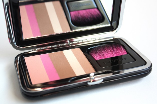
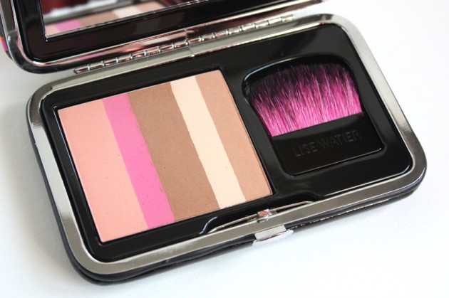
    Of the entire Lise Watier Summer Sunset collection, the one product that’s really won my heart has been this bronzing palette. I haven’t tried out all of the products yet, but the tones in this one are just right — it gives a very clear, effortless bronze, which is exactly what I’ve been loving this season.

    I have a tendency to fall in love with one bronzer at a time, one for every year, and I have a feeling this is going to be my bronzer of 2012 — last year was  FaceFront Third Kiss Rocket Bronzer; the year before that, Annabelle Haute Gold Zebra Bronzing Powder. (True to form, I wore them more or less religiously for a few months, and… haven’t really touched either since.)

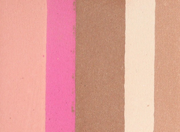
    The shade: Reminiscent of Chanel’s Soliel Tan de Chanel bronzers (limited edition this summer and last – Beauty Look Book has a great post on both years’ bronzers, here), Lise Watier’s Summer Sunset compact contains five different shades, which blend together to create a lovely glow (minus the $60 price tag).

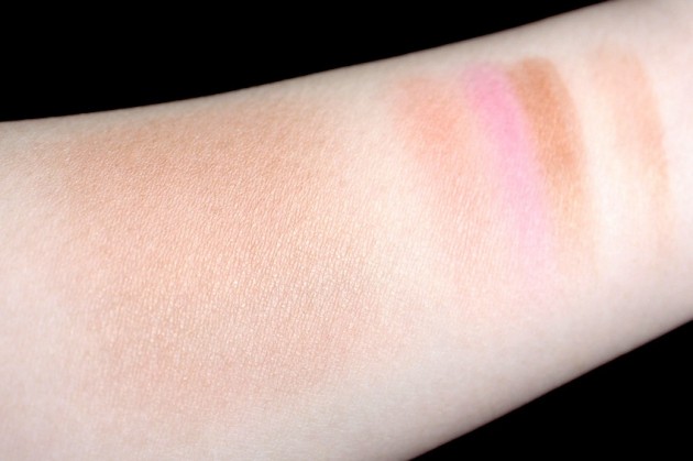
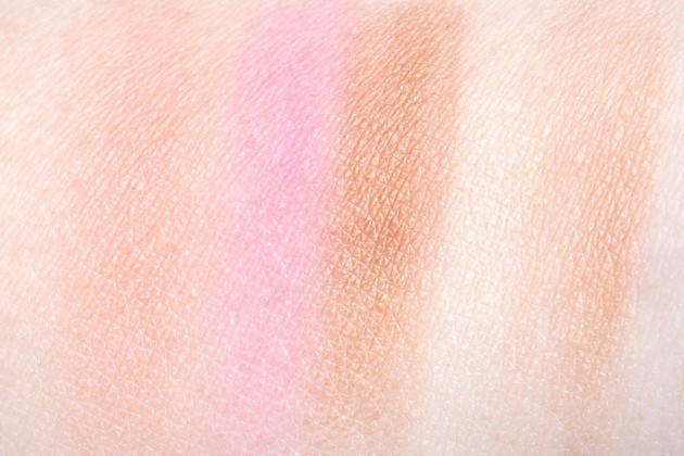
    The brand recommends using the strips of colour in two separate swipes: a focus on the brown shades to add a bronze glow to the high points of the face, and a focus on the pink shades (the two on the left) to add colour on the apples of the cheek. I would have liked to see a bit more pigmentation out of the pink and peach shades–I had to go over each a good ten times for this intensity–but I think the shades themselves were all very well-chosen.

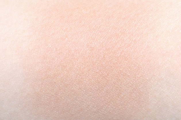
    Swatched alone, the compact houses a pinky peach; a clear, bright pink; a rich golden-brown; an ivory-gold hilighter; and a light gold-bronze. The two bronze shades pack the most shimmer and the softest textures, while the ivory is more glow than shimmer, and the pink and peach are translucent mattes. Blended together, you get a soft, rosy-bronze shade; best for lighter skintones, but good for darker ones as well, if you want a  glow and a bit of colour but don’t expect it to fake a tan.

    Summer Sunset‘s texture was hard enough to irritate me at first (I prefer my bronzers on the soft side), but it layers flawlessly and without a hint of chalkiness. What really makes this product worth a second look, though, is how finely-milled it is — the gold shimmer gives a gorgeous luminescence to the skin, but it’s smaller and less overtly noticeable than the shimmer in any of my other bronzers.

    Lise Watier Summer Sunset Bronzing Powder swatches

    Lise Watier Summer Sunset Bronzing Powder swatch, blended

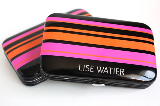
    The packaging: Okay, so I’m not crazy about the aesthetic of this packaging – fuchsia and orange stripes don’t really do it for me. If you love brights, though, these clutches (all of the Summer Sunset palettes come in the same packaging) are a bit brilliant, not to mention quite on-trend for Summer 2012.

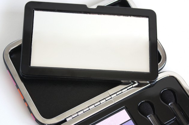
    In a move that I think was very cool, Lise Watier has made this packaging (in a way) reusable: once you’ve hit pan and finished up your products, both the mirror and pans can be removed, to use the case as a small clutch, card case, or clutch/mirror combination.

    (The brush is a nice addition, too; I don’t usually like in-compact applicators, but I’ll make an exception for bronzers. Thin, flat brushes are great for layering on bronzers sheerly — sort of like a fan brush, but more compact and with more control. And, alright, I’ll admit that the black-and-fuchsia bristles are rather charming.)

    The verdict?

    At $35CAD for 11g, Lise Watier’s Summer Sunset Bronzing Powder is on the pricey side for a mid-range buy. It delivers a gorgeous colour, though, more summery glow than autumn fake-tan, and I can’t find anything even vaguely resembling a dupe for it in my collection. (For shade, yes. For shimmer and finish, no.)

    If you’re looking for a natural, luminous summer bronzer, give this one a try. Lise Watier has gotten the peachy-bronze shade just right, and while sheer, the quality is definitely there: it layers without a hint of a powdery finish, and the golden shimmer is more finely-milled than any other bronzer I’ve found.

    Keep reading! »

    Share:

    New 10/06/12

    Strangely enough, nothing’s really launched in the past two weeks — a mid-Spring lull, if you will, in preparation for the Summer. And while it’s a bit odd, I have to admit it’s a nice little break; gives all of us a bit more time to focus on some of the (frankly, rather brilliant) launches of this season before the onslaught of next season’s.

    One thing that did really catch my eye, though, is that Bare Escentuals has yet another Get Started kit out: an $80CAD boxed set with a few more products, a small carrying case, and no DVD.

    It feels a bit like the end of an era, like there’s been a revolution and it’s now being forgotten. I still remember when the original kit launched; how much of a splash it made. The first mass-market mineral powder, ladies and gentlemen. It’s going to change how you think about foundation.

    (But did it? Did they change foundation for you?)

    Share:

    Violet and taupe: a colour match made in heaven | Vasanti Mount Rushmore Silky Eyeshadow Duo review, photos, swatches

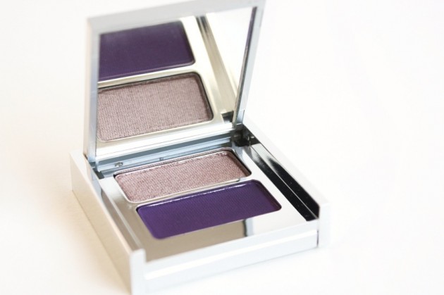
    The product: Vasanti Silky Eyeshadow Duo in Mount Rushmore

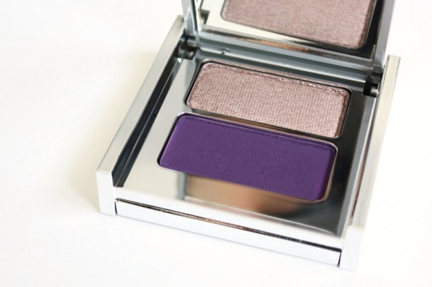
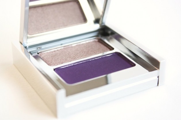
    Mount Rushmore (seen in a look & briefly discussed here) is the first Vasanti eye product I’ve tried, and it really, really didn’t disappoint. If anything, I think it’s even more gorgeous in person than it is on their website; the taupe a little warmer and the violet more moody; more grey.

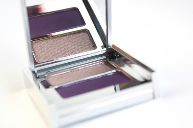
    I’m not crazy about the packaging (the shiny silver edges fingerprint like mad), but for the product inside, I’d put up with a lot. The lid’s a little flimsy when open, but the hinge feels quite secure when shut, and I like the compact size. Honestly, though, this duo could probably be housed in a four-inch glass cube and I’d love it anyways, because seriously, violet and taupe.

    The shades

    Okay; let’s start with the taupe. It’s… well, it’s kind of a taupe lover’s dream come true, to be honest. Finely-milled shimmer, a blendable (but not overly blendable) texture, a paraben-free formula; this one has it all.

    For a taupe, though, it’s all about the shade, not the formula. And this shade is lovely – yellow undertones rather than red, tiny bits of silver microshimmer, and a lovely greyish-brown base throughout. It’s more or less neutral; not warm in the way most brown-taupes are, but not muddy in the way grey-taupes tend to be, either.

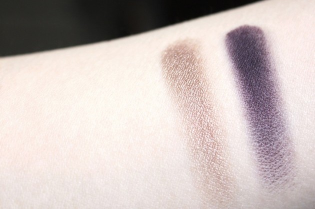
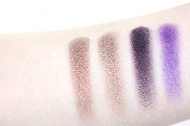
    Applied dry, this is more of a semi-sheer light yellow-taupe; wet or over primer, it’s a more opaque medium-taupe. 

    The matte violet isn’t quite as perfect; but then, when were matte shades ever as easy to pin down? I’ve yet to find the perfect matte formula at all, much less a perfect matte formula from anywhere within the violet range, but I think Vasanti did a terrific job formulating this one.

    While bright and perhaps a little red in the pan, the purple shade in this duo swatches as more of a matte blackened grape – perfect for a dramatic smokey eye, but easy enough to blend out that it could make a good daytime colour, too, if used sparingly. For a $10 matte eyeshadow (the duo’s $20; I’m taking some liberties with the math here), the quality is stellar.

    Without a primer at all, the violet goes on a little patchy; with a primer, the colour is more solid, but still very blendable. When applied damp (photos behind the cut, at the bottom of this post), it becomes an intense, inky black-grape. 

    A quick comparison

    Shimmery taupes and matte violets are probably the two most prominent lovechilds (lovechildren?) of the entire beauty blogging world, so–of course–I had to include a few swatch comparisons. And, likewise as obviously, the two most well-known of each of those categories are MAC Satin Taupe and Make Up For Ever 92, both with cult followings of their own.

    Satin Taupe is fairly close to the top shade of this duo, but it’s not quite a dupe. Vasanti’s version is less red and very marginally less buttery; think violet + chrome undertones, rather than brown + red. With my cool-toned skin and oft sleep-deprived eyes, I prefer Mount Rushmore by a long shot.

    Swatched L-R: MAC Satin Taupe, Vasanti Mount Rushmore (x2), Make Up For Ever 92

    The two violets, on the other hand, couldn’t be more different. MUFE 92 gets lighter, brighter, and almost flourescent when swatched, while Mt. Rushmore presents darker, blackened, and almost slightly desaturated. I can’t recommend one over the other, really, because they’re much too different – I use 92 to intensify violet tones in other shadows, for instance, which I know for sure Mount Rushmore couldn’t do.

    Worth noting about the violets, though: while Make Up For Ever 92 is notorious for awful red staining, I didn’t notice any staining at all with Mount Rushmore, even when swatched wet.

    The verdict?

    Yes. Absolutely yes. At $20 CAD, this not-tested-on-animals eyeshadow duo is a bit pricey for a drugstore buy – but worth every penny. It’s a beauty blogger’s violet and taupe lover’s dream come true, and while the availability’s a little thin on the ground (in-store only in Canada, but the Vasanti site ships worldwide and they do sell out of some other online shops as well), the quality is definitely there.

    I can definitely see why Mount Rushmore is quickly becoming one of Vasanti’s bestselling eyeshadow duos, and I have to admit, I’m a little confused as to why more companies aren’t doing violet/taupe duos! I know Bare Escentuals came out with The Cliffhanger recently, but I can’t think of any others. (If anything else comes to mind, let me know in the comments!)

    Keep reading! »

    Share:

    Don’t miss this | A vampy lip look, inspired by the 2012 Met Gala

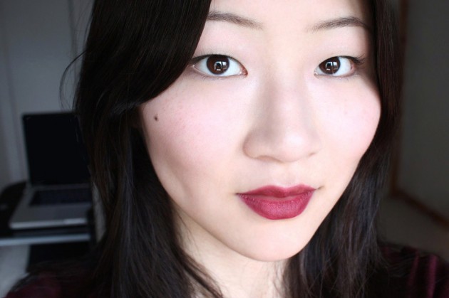
    For this week’s She Said Beauty look, I wanted to do something based off this year’s Costume Institute Ball; something with the dark, vampy lips that were so popular on the red carpet. It’s not your typical Spring lip, but I love a moody red – they’re really striking, but (for once!), the high-impact look requires very little in terms of eye makeup skills, making it easy & accessible. 

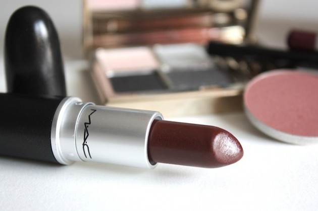
    I swatched a number of different products to pick my vampy shade, and I thought I’d share the swatches with you – after all, my idea of the perfect plummy-red isn’t everyone’s! For something with more brown in it, I liked the MAC Plum + Rimmel True Vintage combination; for something lighter and more neutral, maybe try Bobbi Brown Rose + MAC Desire.

    Lipliner swatches, left-right: MAC Plum, MAC Vino, Paula Dorf Tapestry, Bobbi Brown Rose.

    Lipstick swatches, top-bottom: MAC Desire, Rimmel True Vintage

    In the end, I went with MAC Vino underneath MAC Desire – I liked the intense, plum-bitten red tones of Vino, and Desire (a sheer, Lustre-formula lipstick) toned it down just enough to take it from bright to vampy.

    Strangely enough, though, the real star of this show was Maybelline’s Illegal Length Fibre Mascara. I’ve been testing it out the last few days, and I’ve been really impressed – I’ve been getting some smudging by the end of the day, but for super-long, defined lashes, I think it might just be a hit.

    It doesn’t do much for volume, but to be totally honest – paired with a good, black liner, I’ll take long lashes over “volumized” ones any day.

    Keep reading! »

    Share: