Follow:

    MAC All About Orange, Summer 2013 | On Our Radar

    I get asked pretty often what I use to put together theNotice’s product spreads, and the answer is generally just a simple, basic, “Adobe Photoshop.” What that answer is missing, however, is a quietly reserved, “but it’s an absolute nightmare, and I wouldn’t wish it unto anyone.” 

    That in mind, here’s a super-basic MAC All About Orange product spread. After talking to Chic Geek co-founder & all-around awesome PR girl Kylie Toh, I’m trying to get accustomed to using Adobe Illustrator for future On Our Radar/The Edit features — today’s spread is a complete aesthetic disaster a bit of a visual mess, but I’m pretty optimistic about Illustrator’s learning curve and ease of use.

    The image above is (as always!) clickable & hopefully functional. I’m not much of an orange fan, but there are some pretty pinky-peaches and light apricots in through the collection, too — a little something for everyone, unlike some of this year’s other Summer collections!

    Hope your weeks are off to a great start (even if Mondays are always a bit of a drag).
    Share:

    The pros and cons of mobile & responsive sites, themes, and blogs: Love ’em or hate ’em?

    theNotice on phone vs laptop

    In today’s smartphone-armed world, readership numbers for non-computer devices are going up, up, up. As a blogger, I feel a certain amount of pressure to put together a mobile theme for theNotice; as a reader, however, I really don’t want to.

    Have you ever noticed… that if you read theNotice on your phone, the striped background automatically gets cut off? And, if you double-tap the body text (which is also the same width as the images), the text is still totally readable?

    Yeah. Designed with me you in mind.

    I get the feeling that I’m the exception rather than the norm on this one, but here are a few of the things I love (and hate!) about mobile sites and responsive themes.

    MABB vs Beautezine blogs

    Makeup and Beauty Blog vs Beautezine: two great beauty blogs with very different responsive themes

    Responsive Themes

    Responsive themes (which are much, much more common for independently-run blogs) display the same content as the desktop site, but switch over to a different layout depending on what kind of device you’re viewing it from. I have a lot (too many!) thoughts on them, so I’ll leave you to a bit of point-form:

    The pros

    • Faster load time
    • Better text scaling
    • Single-column
    • Homepages typically load only the title & featured image of a post

    Responsive mobile vs desktop theme

    A cross-platform example of a recipe from the BBC’s Food section: Gingerbread Biscuits on a desktop site, a mobile site, and a desktop site as viewed on a mobile device. 

    The cons

    • Sites can get “stuck” on one theme 
    • No zooming in on those tiny images!
    • Default themes are boring and (let’s admit it, they totally are) kind of unsightly 
    • Square ads take up a lot of your screen real estate
    • “Sticky” banner ads frequently glitch when scrolling
    • Single-column layout pushes sidebars, search bars, and widgets to the bottom
    • Swipe-happy themes often interpret scrolling as a desire to go forward/back a post… or maybe that’s just me and my short thumbs.

    Mobile layouts kind of suck

    Awkward ads, bottom-of-the-page search bars, and stuck-on-mobile sites

    Mobile Sites

    Unlike a responsive layout, a mobile site is separate from a web version — meaning that, for a blog, you’ll often not see recent material until the mobile site gets updated, too.

    H&M mobile site example

    H&M’s desktop vs. mobile sites

    Keep reading! »

    Share:

    essie x Ralph Lauren Big Pony: The Sensual Set (#2 Pink) | When fragrance & nails collide

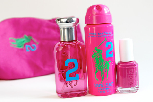
    !Ralph Lauren x Essie pink

    Out this spring from Ralph Lauren is a bit of an interesting collaboration: for each of their four Big Pony Women’s fragrances, Ralph Lauren has teamed up with Essie Weingarten herself to create a matching Essie nail varnish.

    On top of that–if, perhaps, you’re looking for a little nail inspiration!–Essie Canada had Rita Remark, lead national nail artist, to create a custom nail look for each fragrance.

    Essie x Rita Remark x Ralph Lauren

    The product: Ralph Lauren x essie SENSUAL (Ralph Lauren Big Pony Woman & essie in Pink #2)

    Big Pony Woman Pink #2 isn’t exactly my kind of fragrance. With notes of of cranberry and tonka mousse (and only those two), this fruity floriental is just one in a vast number of sticky-sweet perfumes today.

    Maybe I’m being a bit harsh–okay, I’m definitely being a bit harsh–but for someone who wears men’s colognes almost exclusively… great marketing and cute collaboration aside, this post should have been a pass for me.

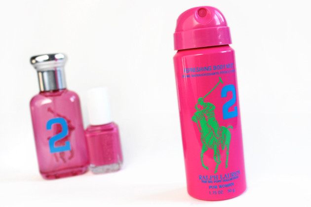
    !Ralph Lauren Big Pony body spray

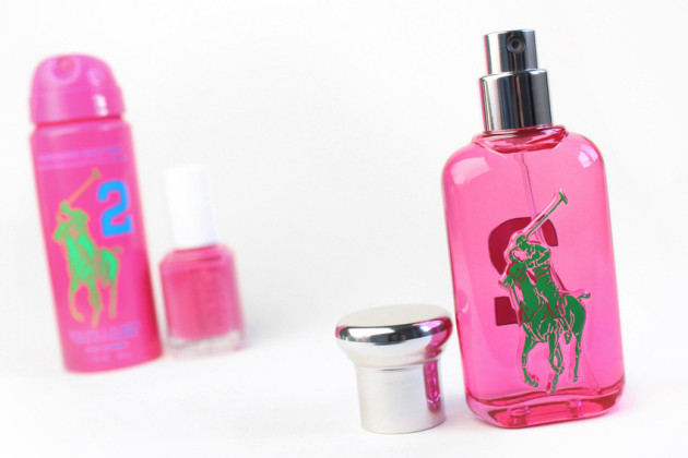
    !Ralph Lauren #2 fragrance

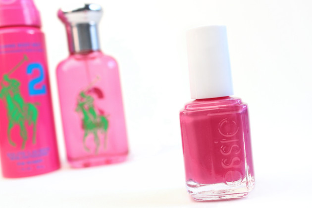
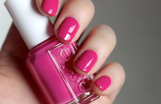
    Essie review - pink Ralph Lauren polish

    The Big Pony sets’ saving grace, however, are the bright, vibrant Essie nail varnishes. I’m not always swayed by their polishes (I find the dense narrow brush difficult to work with), but #2 Pink is one of the few Essies I’ve easily managed to get smooth, glossy nails out of in just two coats.

    I’m not nearly nail-savvy enough to manage Rita Remark’s criss-cross nail art, I’m afraid, but I loved the specific hue of this creamy blue-pink nonetheless. It may not be the most unique shade, but it’s a great pick for a pink untouched by this season’s fluorescent polish trend!

    Essie nail swatch - Ralph Lauren pink #2 polish

    Try it if…

    There’s a Ralph Lauren Big Pony scent that you already know you love, but otherwise, pass. These sets would make great gifts, however — while I wasn’t a fan of the saccharine #2, it wouldn’t be a stretch for me to imagine an Aquolina-Pink-Sugar-loving teenage girl adoring this cotton-wrapped confection.

    Also in the range are #1 Blue (grapefruit & blue lotus), #3 Yellow (pear & mimosa), and #4 Purple (wild cherry & purple amber).

    Keep reading! »

    Share:

    Lancôme x Alber Elbaz: 1’30” of whimsy | Teaser #1

    @Alber Elbaz for Lancôme

    This morning, Lancôme released the first of three teasers for their Summer 2013 Lancôme x Alber Elbaz collection film, which will be released in full on June 3rd. For those of you who really can’t wait for more, though, keep an eye on Lancôme Canada’s YouTube and Facebook pages for two more teasers between now and the 31st.

    To deliver Elbaz’ “transition from the real to the surreal,” Lancôme worked for more than six months with Box Studios’ Pascal Dangin to animate his wonderfully whimsical drawings into a 1 minute and 30 second film. Expect to see the metamorphosis of a fashion show, where the eyes in the front row transform slowly into bottles.

    It’s not your standard makeup company fare, and I’m excited to soon be able to see the film in full.

    Not only is this the first time Elbaz has collaborated in creating a make-up collection, but this collection also marks a first for Lancôme: despite their iconic range of mascaras, never before has this 78-year-old French luxury cosmetics house dabbled in false eyelashes.

    The limited-edition Lancôme x Alber Elbaz collection will be available worldwide from June 15th (a very long six months since it was first teased). The collection will include mascaras, palettes, eyeshadows, and false eyelashes.

    Share:

    Sephora + Pantone Color of the Year 2013: Emerald | Reviews, swatches, and far too many photos

    Sephora + Pantone Universe Color of the Year 2013

    This year’s Sephora + Pantone Universe Color of the Year collection has been out for a few months (since March), but I haven’t really been “feeling it” — until now, that is.

    With the weather finally warming up & the sun coming out from behind the clouds, 2013’s vibrant collection of Emerald products is (finally!) in-season and on-trend. Perfect for creating a summer smokey eye, or adding just a touch of bright green, now is the perfect time to pick  up a couple bold green products to add to your summer makeup kit.

    Blogger’s note: so, this post ended up at around a thousand words. Click here or scroll past all the pretty pictures for a two-sentence rundown of each product.

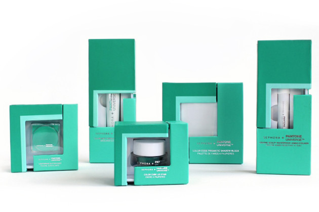
    The product: SEPHORA + PANTONE UNIVERSE Color of the Year 2013, Emerald (assorted products)

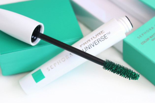
    Sephora + Pantone Color Watt Highlighting Mascara

    Color Watt Highlighting Mascara

    Sephora + Pantone Universe Color Watt Highlighting Mascara ($22 CAD)

    Funnily enough, I thought this was the best and worst-performing product in this year’s Color of the Year collection. Dry, matte, and intensely pigmented, the Color Watt mascara really does show up green on the lashes — even short, dark, sparse lashes like my own.

    There’s a lash photo of this at the end of the post, but in a nutshell: yes, it absolutely does show up, but the gorgeous green pigment is its downfall, too. It sits in tiny, dry clumps on the lashes, adding neither length nor noticeable volume, and stains for days if it touches the skin.

    The stain can be avoided if you carefully remove your mascara with an oil-based or micellar remover on a cotton pad, rubbing down the lash against a halved cotton pad covering your undereye area, but it’s a hell of a hassle for a single effective-but-kitschy product.

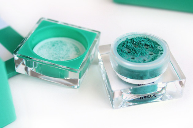
    Sephora + Pantone Universe Emerald Glitter

    Lightspeed Glitter Dust

    Sephora + Pantone Universe Lightspeed Glitter Dust ($17 CAD)

    On the polar opposite end of the spectrum is the Lightspeed Glitter Dust, which is dry, loose, and milled just large enough to stay on this side of shimmery. The green base is very sheer, and the plentiful sky blue shimmer really predominates, giving it an almost turquoise tone overall.

    Like any glitter dust, this really needs a base to stick to, so be sure to have one on hand! On completely dry skin, it comes right off, but on primed or even just freshly-moisturized skin, it adheres like a charm.

    Sephora Pantone Color of the Year 2013 swatches reviews

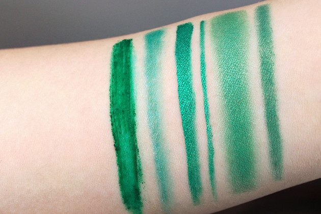
    L-R: Color Watt Highlighting Mascara, Lightspeed Glitter Dust, Color Cube Lid Liner Stain (x2), Color Code Prismatic Shadow, Graphic Sculpt Waterproof Jumbo Liner

    Sephora + Pantone Lightspeed Glitter Dust

    Lightspeed Glitter Dust

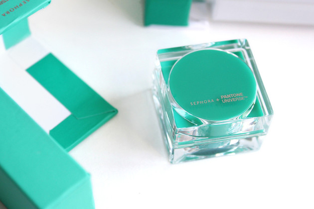
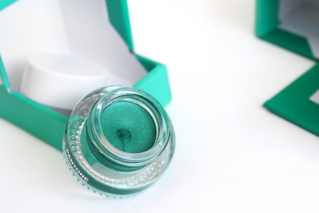
    Sephora + Pantone Universe Color Cube Lid Liner Stain ($19 CAD)

    May I please introduce you to the Sephora + Pantone Universe 2013 cream of the crop? The Lid Liner Stain (which, despite its name, absolutely does not stain) is gorgeous — a well-pigmented shimmery-or-metallic emerald, it makes me think of all the best parts of the Emerald City.

    The smooth, light texture of this Color Cube “stain” blends out easily as a wash of green with finely-milled shimmer, but works as a seriously stunning metallic emerald liner, too. Basically, it’s everything the Color Code Prismatic Shadow (below) hopes to someday be.

    Sephora + Pantone Lid Liner Stain

    Color Cube Lid Liner Stain

    Keep reading! »

    Share:

    Polished & Pink: Five Summer-Ready Spring Picks | On Our Radar

    Set to conquer in three… two… nope

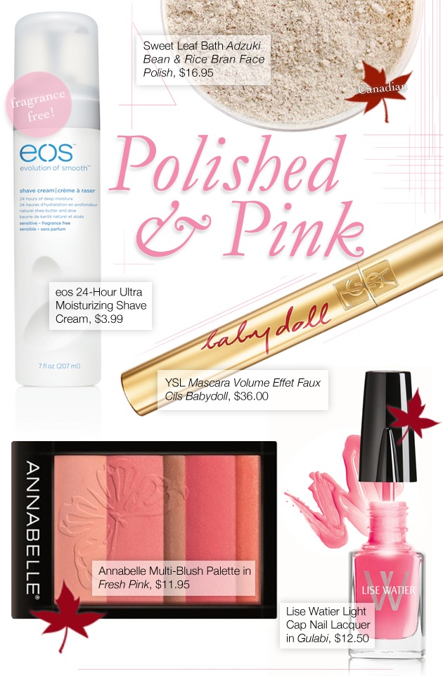
    I have zero inherent talent for anything design-related (or even design-adjacent, really), so product spreads are always a little tricky for me. If, by “a little tricky,” you mean “a time suck and a constant source of frustration,” that is.

    Despite the sweat and tears and hours and hours and hours that go into these posts, though, I still quite enjoy putting them together — the challenge, when I can come out on top, is incredibly rewarding.

    I hope you enjoy this week’s picks (even though I didn’t quite manage to conquer the image).

    Skincare sweethearts

    This week’s picks started off with the Sweet Leaf Bath Adzuki Bean & Rice Bran Face Polish, which caught my eye as a low-end Canadian alternative to the Tatcha Polished Rice Enzyme Powder ($65 USD). While Sweet Leaf’s version doesn’t have the same wow! factor or enzymatic powers, it’s still a very cool powder-format face polish for those of us on a tighter budget.

    Also in the skincare department is the eos 24-Hour Ultra Moisturizing Shave Cream, which is a great silicone-free, scent-free shaving cream for those of us who want to keep our showers simple.

    Keep reading! »

    Share:

    New 16/05/13: Spring/Summer Beauty from NARS, Illamasqua, & more

    I’ve been playing around with a few new formats for things, recently, so here’s a “New This Week” post that’s sorted a little differently than usual.

    Feel free to let me know what you think of it in the comments, or just quietly peruse the beauty launches that have caught my eye this month!

    To start us off, the highlights:

    Spring lip focus

    Bare a little skin

    & everything else

    Share:

    Bright Blue Pastel Lids | Topshop AW13 (Drugstore Eyes!)

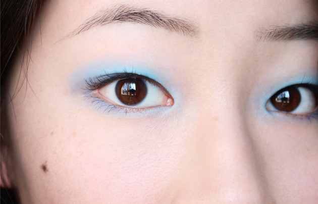
    !Soft blue eyeshadow Topshop look

    Okay, so: I know I haven’t been the best about posting recently, but I’m trying to be better, I swear. I think I still need a couple weeks to really get back into the swing of things, but I may as well start now!

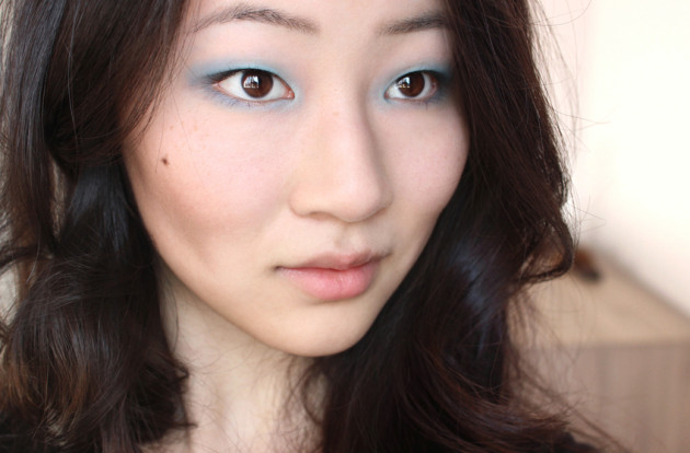
    Here’s a quick, springy look to start off the week. Created by Hannah Murray for Topshop AW13 at the last last London Fashion Week, the look is “a bit Brit pop, a bit Eighties, a bit New Wave with an urban edge,” according to Murray. Backstage artists paired fresh skin with almond-shaped pastel blue eyes, and — I don’t know. It’s a bit of a “look,” isn’t it? Super-easy, but still not something I could ever see myself really loving.

    Read Vogue’s backstage report for the show here, and catch a full tutorial here.

    !Pastel bright blue eyes

    Topshop recommends using their Eye Crayon in Kingfisher to get this look, but it’s not actually what was used backstage. Rather, Murray put down a green eyeshadow base (I’m guessing a cream eyeshadow), then topped it off with a pale blue eyeshadow.

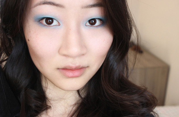
    I went with a more direct approach, layering a white primer with a matte blue eyeshadow, but I would have liked to have used something with more intensity — the soft “glow” was lovely in real life, but I think the way it photographed left a little something to be desired.

    You win some, you lose some, I guess!

    1. No makeup look (prep)

    Start with a blank canvas

    2. Cornflower blue makeup (intermed step)

    & add a little colour. (Pre-blush & mascara)

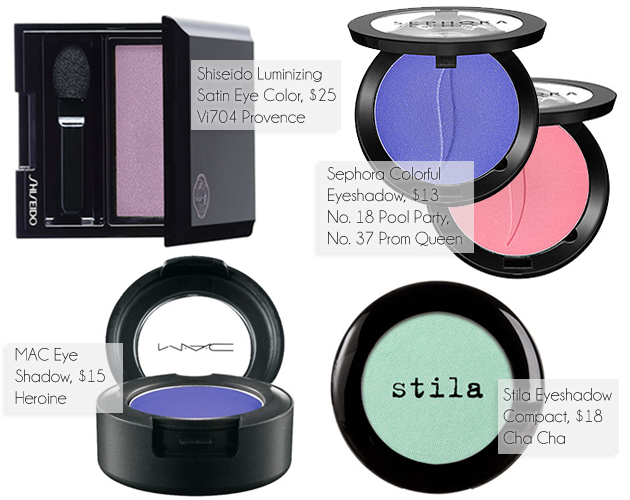
    The cool thing about this look, though, is that you could honestly sub in whatever shade you wanted to. I love the look of a matte finish for an eye like this, but I’m not crazy about bright blues — I think I’d have loved to do a lilac or a cobalt instead (both of which happen to be part of Sephora’s current ColorVision forecast, handily enough!)

    Here are a couple springy shades that caught my eye:

    Colourblocked pastel eyes

    Shiseido | Sephora | MAC | Stila

    Keep reading! »

    Share:

    YSL Glossy Stain in Pêche Cerra Colla review, swatches, photos | YSL Rouge Pur Couture Vernis à Lèvres

    YSL Glossy Stain review swatches - Peche Cerra-Colla

    The product: Yves Saint Laurent Rouge Pur Couture Vernis à Lèvres Glossy Stain in No. 27 Pêche Cerra-Colla

    The shade: I have to admit, Pêche Cerra-Colla isn’t exactly my usual shade. A slightly pinked peach, it has a blissfully shimmer-free finish, and fades to a soft, super-sheer tangerine.

    A solid “medium” in both opacity and depth, this peach Glossy Stain is darker than my bare lips, but creates a very natural effect — far from bold or brash, it delivers good colour while still maintaining a wonderful visual translucence. Though the touch of pink makes this wearable on my cool, pale complexion, I can see it creating a beautiful “my lips but peachier” shade for warmer skintones, too.

    YSL Glossy Stain Rouge Pur Couture review, packaging

    YSL Peche Cerra-Cola review swatches photos

    The application: Like many bright, translucent stains, Pêche Cerra-Colla applies with a milky finish that soon disappears (think Benefit Posietint, but better). The applicator is a thin, slanted doe-foot, and it distributes the perfect amount of product for an even, glossy lip.

    It’s not your typical applicator, but that only makes me like it more. The thin profile keeps you from picking up too much product, and the shape makes it easy to both apply product quickly & get right into the corners and edges of the lip.

    YSL Spring lip launches 2013

    Swatched L-R: YSL (1) Volupté Sheer Candy in No. 12 Tasty Raspberry, (2) Glossy Stain in No. 27 Pêche Cerra-Colla, (3) Glossy Stain, sheered out

    The wear: The internet is a crazy place, but they get some things right… one of them being that YSL’s Glossy Stains are awesome.

    Lightweight and relatively non-sticky, even a sheer shade like Pêche Cerra-Colla wears for ages: I can get a solid five hours with a glossy finish (if I don’t eat or drink anything), and a few more with just a light stain. While not hydrating, it’s reasonably comfortable for a solid 5-6 hours, even on my dry lips — as long as there’s still a tacky finish, the Glossy Stain formula is incredibly easy to wear.

    YSL Peche Cerra-Colla swatches Rouge Pur Couture

    L-R: YSL Framboise Craquante, Pêche Cerra-Colla heavily/sheerly

    YSL glossy stain review - Peche Cerra Colla

    YSL Pêche Cerra-Colla Glossy Stain – stainsYSL Peche Cerra-Colla Glossy Stain review, swatches, photos

    The verdict?

    Like almost everyone else who has tried out a YSL Glossy Stain, I’m pretty smitten with them. While I could do without the added fragrance, the Rouge Pur Couture Vernis à Lèvres Glossy Stains (what a mouthful!) pair fantastic wear time with ease-of-use, comfort, and a fantastic shade range. They’re as easy to apply and wear as a gloss, but you get the extra-long wear time of a stain, too.

    Availability:$34 USD/$36 CADPêche Cerra-Colla was new this January with YSL’s Arty Stone Spring 2013 collection, but is now part of the permanent line.

    Recommendations, dupes, lip swatches & more »

    Share: