I promised some comparison shots to follow Wednesday’s Infinity Effect How-To, so here they are!
All images here are un-photoshopped – save for cropping and resizing – and feature the infinity effect backdrop on the right. (Left = lightbox). They’ve all been taken in indirect sunlight without flash support and enlarge to ~1000px if you click on them. (If this was a product review post or something, I’d also tweak the colour balance and curves of the image, which is why they might look a little different from usual.)
Small objects
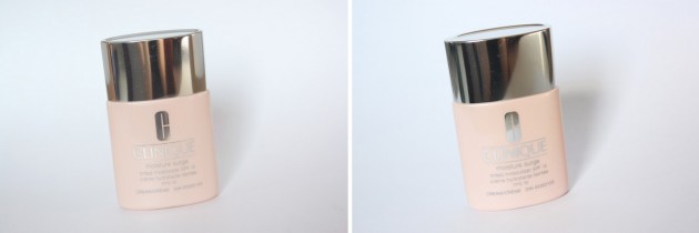
I snapped a few shots of Clinique’s new Moisture Surge Tinted Moisturizer to show this one off, and it’s with your small objects that you’ll see the least difference between the two. (Clinique foundation bottles are about 3″/8cm tall.)
Tonally, they’re a little different, but probably won’t see much of a difference between a lightbox and an infinity effect backdrop if you’re just photographing small products. (The lightbox does produce slightly softer lighting, though, as it sort of bounces around off its sides.)
Large objects
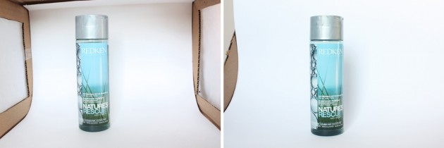
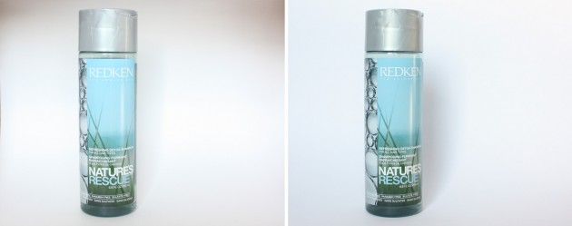
Once things get a little taller, I think the differences become more noticeable – with soft sunlight coming in from my window at a bit of an angle, the lightbox sort of forms shadows within itself.
The product featured below is the Redken Nature’s Rescue shampoo, which is about 7″/16cm tall. Here are the photos as they’d appear from the camera:
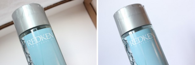
I’d definitely re-crop those before putting them into a post, though, and the difference only becomes more clear when you do so:
Finally, I wanted to show a “shot from below” of a taller object. With a small lightbox, you’ll end up photographing the top quite quickly! A larger lightbox or an infinity effect backdrop would give you a bit more shooting space for things like this.
One more thing to note
The room that I take my photos in has very cool ambient lighting*, and it definitely shows when I take photos using my infinity effect backdrop. The lightbox, however, creates a more controlled environment. Because the white fabric around the sides leans slightly warm, and because the box itself is a warm brown, the photos appear more neutral.
*Which, for the record, doesn’t include any fancy-schmancy lighting; just a bit of colour theory with my walls!
If you find your ambient lighting toying with the colour tones in your images, don’t fret – all you need to do is set your camera’s white balance (which I’ll talk about later in the Tips for Beauty Bloggers series) or tweak the images slightly once you upload them to your computer!
That’s all we have for today. Hope this was helpful, and as usual, feel free to ask any questions you may have in the comments! xx
