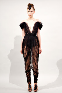
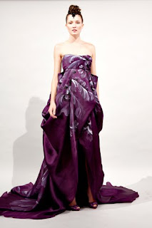
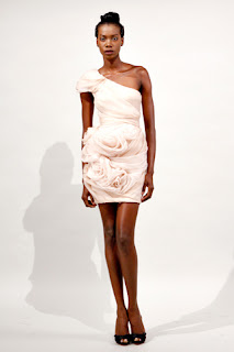
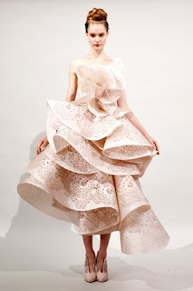
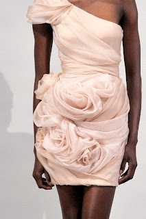
I usually love Marchesa. Wholeheartedly. But while there were plenty of gorgeous pieces in this upcoming Spring’s collection, there were a lot of “what the hell were they thinking?!” moments as well.
Like this one:
Or this one:
Or THIS one:
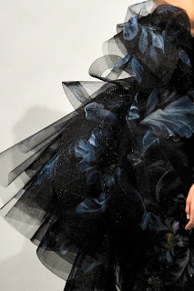
But we’ll excuse these mistakes, at least for now. Why, you ask? Well, here’s why:
Sidenote: as much as I feel loyal to Style.com, I’ll definitely be leaving it for Vogue.com if they don’t step up their game, stat! I love their easy-to-navigate, incredibly complete coverage… but the photography usually just doesn’t cut it. Do they do a good job of it? Yes. But the problem isn’t if they do a good job or not; it’s if other sites are doing a better job of it. And yes, yes they are indeed.
