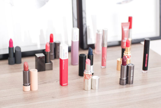
 Revlon Super Lustrous gloss in Nude Lustre is much too warm for me.
Orange-toned, this gloss’ main downfall is its colour – the problem is not in the formula (glossy, fairly pigmented, and decent-smelling, though nothing fabulous) but the shade.
I’ll give you a full review when I have a chance to try this in a different colour and wear it around for the day, because I think these glosses could be great. This one, however, is way too orange for me! Maybe a warm-toned beauty could pull it off, but not me. I just looked awkward and jaundiced.
 Orange like you’ve been eating too many carrots
 If your blood is this colour, call your local poison center immediately.
But alas! This is not the focus of the post. How would you like your swatches from now on?
1. The way they usually are – swatched on the arm, on the lips, and with a product photo (like above)
2. Holding the product with an inside swatch, (below) plus a lip swatch 
3. Holding the product to the side with a swatch on the back/side of my hand (below), plus a lip swatch
It’s your choice! If I find I hate it, I might not listen to your choice… but whatever! I think I like the product photo separately, but sorting photos and keeping track of which swatch is for what item is a lot easier if they’re in the same frame.
And hey, if you have any other suggestions, go ahead and suggest away!
