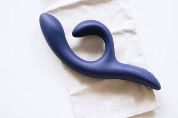
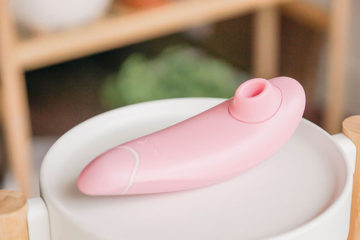
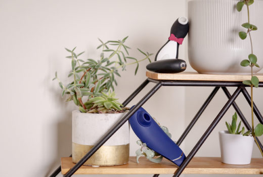
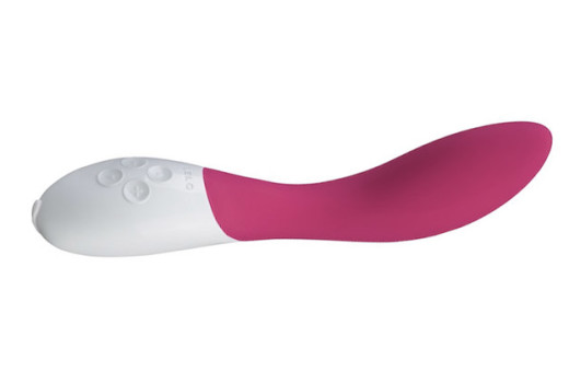
Love, Chloé Purse Spray review, photos

Friday, April 27, 2012

The product: Chloé Love, Chloé Eau de Parfum Purse Spray

I have, admittedly, been sitting on this review for quite a while – but can you blame me? There’s something just so utterly photogenic about a well-designed perfume bottle, and the purse-sized Love, Chloé is no exception.

Anyhow; I ended up being more than a little overwhelmed by the chic gold casing of this particular flacon, and the number of photos I had sitting on my computer was… a bit intimidating, to say the least.

The scent

Love, Chloé is described as “[the embodiment] of all the olfactory vocabulary of cosmetics… a fine, powdery scent, light and sensual with a flowery wake, iridescent and musky with talc and rice.” And, to be entirely honest, I don’t think it can be put any more succinctly than that.

Created by Louise Turner and Nathalie Cetto-Gracia (Givaudain), Love, Chloé features top notes of orange blossom and pink pepper; heart notes focusing on iris absolute, but adding a blend of lilac, hyacinth, wisteria blossom, and heliotropine (for its suggestion of almond and vanilla); and finally, base notes of musk, talc, and rice powder.

What I love about this scent is how effortlessly feminine it is - feminine, not the overly-powdered girlishness of so many celebrity fragrances. It’s certainly not for everyone (my sister, who hates powder notes, can’t stand this one), but I was quite surprised to feel as strongly about it as I do.

The blend of powders, florals, and musks is just so, and despite quite disliking about the original Chloé, I’ve been reaching for this one much more often than I’d anticipated.

The packaging

The Love, Chloé Purse Spray is actually a small, refillable casing about 3 1/2″ tall and 1 3/4″ wide. Its build is plastic, surprisingly, with a glossy outer finish – giving it a more expensive feel without sacrificing its lightweight nature.

The refills (10ml x3) are the usual glass-and-spray combination, and fit quite securely into the bottle. The chained lid is a good fit as well; it’s nice not to have to worry about losing the cap on the go, and it sits snugly enough that I wouldn’t worry about it coming off in my bag.

My one qualm with the entire product is the twist-off base – I changed the refill just to see how it would go, and warped the slot a bit while I was at it. The purse spray is limited edition at the moment (and I’ve got my fingers crossed that it’s still on shelves), but I’d really like to see it added to the permanent Love, Chloé lineup.

In which case: it would be really nice to see the addition of a metal base, Chloé!

The bottom line

Packaging aside, I fell a bit in love with Love, Chloé this winter. It’s not my typical sort of scent (I tend to stray more toward unisex fragrances; think amber and patchouli rather than soap and citrus), but it snuck under my skin and I couldn’t (didn’t even want to) get it out.

Love, Chloé smells like something from the past; a classy, demure blend of powder and florals that would pair just as well with ’40s hair and red lips as it would with a neutral eye and a silk shift.

Availability and a couple more photos »

The unexpectedly perfect Spring palette: Hello Kitty Graffiti Eyeshadow & Blush Palette

Wednesday, April 25, 2012

The product: Hello Kitty Graffiti Eyeshadow and Blush Palette

The packaging: Alright, so I’ll start with the packaging, because I’m a little love/hate about it. On one hand, I’m not twelve, I’ve never understood the Hello Kitty appeal, and I can definitively say that I dislike the graffiti-ness of the Graffiti palette*.

*Partly because I’m not big on random splashes and speckles of colour; partly because it “pays tribute to the daring artists who decorate Hello Kitty’s favorite downtown sidewalks.” I happen to disagree vehemently with the whole “defacement of public property is cool!” mentality, so.

(I  mean, don’t get me wrong – street art is very cool, but only when it’s been encouraged and/or commissioned!)

On the other hand, though, I like the solid build of the packaging, the bi-layer design, the inclusion of a mirror, and (dare I say it?) I’m even a little fond of the silver bow. Plus, each palette’s packaging is unique (compare this one to the Sephora stock image if you’re confused), which is quite cool.

The eyeshadows: On the Sephora site, the four shades are listed as a shimmery gray, a greyish teal, a soft pink, and a charcoal. Unlike a lot of product listings, I’d say those descriptions are actually spot on, which is a nice deviation from the norm!

The shimmery grey is on the sheer side, with a watery, translucent vibe and a bit of taupe hidden in the shade. The greyish teal is a breathtaking, intense, slightly desaturated teal. (Aside: I’m really liking this “greyish teal” thing — here’s to hoping we see more of it in the next few months.)

The soft pink is the sheerest shade of the four, with wearable yellow undertones and a very low likelihood of making you look like you have pink eye. Finally, the charcoal is a deliciously pigmented, easy-to-blend dark grey.

All four shades are soft, blendable, even-textured and shimmery.

Hello Kitty Graffiti Palette – eyeshadow swatches, dry on primed skin.

The blushers: I admittedly paid less attention to the two cheek products in this palette, but I can tell you that they’re really quite pretty. And I swear, whoever produced this palette got right into my brain when they did the finishes – the eyeshadows are just the right kind of shimmery, and the blushers are spot-on as well.

The shades are described as a bronzy peach (completely matte; think of a cross between a peach blush and a contour powder) and a dusty pink (that newfangled sort of matte – you know the one; where it’s matte but if you look really closely at the pan, you can see a few super-tiny bits of shimmer?).

And, well, yeah. They’re both kind of lovely; pigmented and smooth. Both shades are medium-toned, as well, so most skintones won’t have to worry about them showing up – they’ll be more obvious on lighter complexions, of course, but I can see them working on most.

Hello Kitty Graffiti Palette – blusher swatches; heavily then blended out.

The verdict?

You guys. You guys. This is perfect, absolutely perfect, for Spring.

I’m in love! I’m in love with a ridiculous-looking Hello Kitty palette and I can’t even bring myself to care because everything inside it is just so pretty!

On a more serious note, though, I was actually quite impressed by the quality of this palette – the shades are gorgeous, both individually and together, and the quality of each of the six (four eyeshadows, two blushers) products ranges from “good” to “great.” It’s hard–harder than it should be–to find a palette without a “weakest link,” but Graffiti manages it with grace.

And it’s paraben-free. And on sale. I don’t think it gets any better.

Ingredients, Graffiti vs. Blue Sky, & a whole bunch more photos »

COMING UP | Hello Kitty Graffiti is (weirdly enough,) like Clarins Blue Sky… remixed.

Monday, April 23, 2012

Come on. I can’t be the only one who thinks so, right? I mean, obviously, the palettes aren’t dupes of one another, but I do feel like they run on the same idea: one shimmery charcoal, one gorgeously desaturated teal, and two lighter shades to add brightness.

Review, swatches, and (probably way too many) additional photos of the Hello Kitty palette are in the works. (And on that note — seriously, you guys, Hello Kitty?! I did not expect to get along with this palette, much less actually like it. But I do, which I’m finding a bit mind-boggling.)

Because I’m slow While you wait extremely patiently because you are wonderful humans In the meantime, be sure to give this Clarins Blue Sky review a look if you haven’t seen it yet, and don’t miss last Monday’s Blue Sky eye look.

Clinique Quickliner for Eyes Intense: Intense Charcoal, Intense Ivy swatches

Monday, April 16, 2012

Despite the rather unfortunate wear time, I’m still a bit head over heels for the gorgeous intensity of the new Clinique Quickliner for Eyes Intense eye pencils. Here are eye swatches and descriptions of Intense Charcoal and Ivy; for Intense Black and Plum, please visit this post instead!

Swatched L-R: Clinique Quickliner for Eyes Intense in Intense Black, Violet, Charcoal, and Ivy.

Intense Charcoal

Used also in this week’s ethereal blue Clarins Colour Breeze makeup look, Intense Charcoal is a dark, gunmetal grey with silver and gold microshimmer. While definitely still dark enough to bring a bit of depth to the lashline, it’s a good deal less sharp than a straight-up black, and it isn’t as obvious as a soft navy – a good choice for a softer, more romantic eye look.

I have absolutely no idea what else I used in these photos, but I believe a I had outlined a similar eye look to go with the Intense Plum swatch (in part 2 of the review.) Apologies in advance! I rather wish I could remember what I had used on the outer half of the lid, though; I’m rather fond of how it captured on film.

Clinique Quickliner for Eyes Intense in Intense Charcoal lid swatches

Wearing Clinique Intense Charcoal

Intense Ivy

My current favourite of the range, Intense Ivy is a gorgeous gold-flecked green – darker than olive drab but lighter and more yellow than hunter green. ”Ivy” is a fantastic description of the dark olive shade, with its intense pigmentation and yellow tones; it’s a very earthy green, with a rustic feel rather than a synthesized one.

I can see this working on all skintones, but I think it would be particularly gorgeous on olive complexions.

Clinique Quickliner for Eyes in Intense Ivy lid swatches

Wearing Clinique Intense Ivy

I believe that’s all for the Quickliner for Eyes Intense pencils on theNotice, folks. Hope you enjoyed the coverage! I do plan on doing a comparison with the Quickliner for Eyes (original) range sometime in the near future, though, so keep your eyes peeled for that if you’re interested.

(And, I suppose: don’t hesitate to give me a sharp jab in the side in a month or so if I seem to have forgotten. Because if that’s the case, I probably have.)

A bit of weekend catch-up

Saturday, April 14, 2012

Just a few follow-up photos to past reviews, today – answers to questions and requests that came to my notice while I was sorting though an old folder of photos.

From late last year: a full-face swatch of MAC Desire, seen also here.

For a question left on a very old Marcelle review: a comparison of Marcelle’s two loose face powders, Translucent and Translucent Medium. They’re on paper rather than skin for less undertone interference; I hope it helps differentiate between the two!

And, finally, from last month: a full-face swatch of Physician’s Formula’s pH Matchmaster gloss in Light Pink, my current favourite lip product.

Feel free to add any additional questions or requests in the comments! Additionally, I’m going to go ahead and apologize in advance for next week – posting might get a bit patchy with Winter term finals. theNotice should be back to normal by next weekend, though, so I’ll talk to you then!

Related Posts Plugin for WordPress, Blogger...