


The Fun Mom, you say? Yes: In the words of Amy Poehler in Mean Girls in both 2004 and 2024, we love a Fun Mom. She deserves the world and more, minus a Chihuahua going at her sausages. (If you got that reference, you’ve watched too much behind the scenes Mean Girls footage and interviews.) While Poehler’s character was, ostensibly, actually a terrible mom in both of these movies, the pop cultural phenomenon lives on.
Here are some gift ideas for the Fun Mom in your real life—the mom who’s always there for you, but also has her own thing going on.

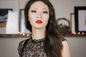
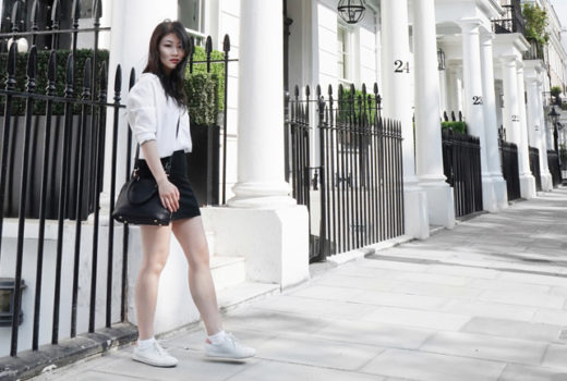
Mother’s Day accessories à la The Idea of You
I recently watched The Idea of You and… Kind of loved it, honestly. In an era where the classic rom com is dead (or at minimum really struggling with its own revival), it’s a fun, silly moment. Anne Hathaway had me hanging on her every word, and the chemistry between her and Nicholas Galitzine is phenomenal—like a black hole that fills you up with bubbly, nervous excitement. Try as you might, you can’t escape its pull.
One thing I could not stop staring at the entire movie, however, were Solène (Anne Hathaway)’s Celine 50mm sunglasses. The enormity of the frames worked so well for her character, and let’s be honest: Anne Hathaway looks amazing in any oversized frame.
Her Celine 50mm Gradient Small Cat Eye Sunglasses (available at Nordstrom) keep selling out in their black/tortoiseshell colourway, but I’ve been wearing a similar pair of chunky Vincero Emery Sunglasses (available at Nordstrom) in Rye Tort this spring. They’re a comfortable, solid frame that sits well on my Asian nose bridge and would make a great gift for mom.

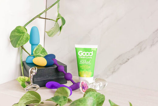
Fun, flirty fragrances as Fun Mom gift ideas
A fragrance launch was the last thing that I was expecting to see from Charlotte Tilbury this year, but that’s exactly what we’ve gotten—and just in time for Mother’s Day, too. I love this array of six fragrances because they feel like such a great “young mom” gift to me: Something to get a mother or caregiver in your life that’s fun, flirty and wholly un-serious. Even the flacons are unique and vivid, with crystal-stopper-like caps feel witchy and playful.
The fragrance featured here is the unisex Love Frequency (find it at Sephora and Charlotte Tilbury), which is a “floral woody musk” designed by Anne Flipo (of Chloé Love Story fame). It’s big and bold, with enormous sillage and a oud-y profile that’s just as intriguing on any gender. Keep your eyes on this spot for a future review, because I’ll be covering all six scents in the Charlotte Tilbury Emotions collection.
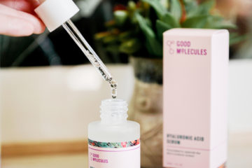
Also pictured here: Clarins Double Serum Eye (also at Sephora). Because, while we can all smell like we’re still 25 and fascinating, sometimes those eye creases creep up on us anyways. If you haven’t used a Clarins Double Serum before, you’re in for a treat—these serums smell incredible and come with two “dosage” settings, which is something I love about them. It seriously helps cut down on product wastage, which is extra-important for pricier skincare products like serums and eye treatments!

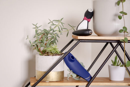
The Muse Headband: A gift mom can use all year
Okay. So there are three main products in the smart self-care category: The Muse, the Sensate, and the Apollo Neuro. I’ve reviewed two of the three, and the Muse is the one that I truly believe in. (The Apollo Neuro, to be honest, kinda just feels like junk science.) All three of these products are priced quite high, but the Muse actually gives you feedback. The Sensate and Apollo Neuro seem like they will, in their product copy, but actually have no biofeedback component.
I’ve reviewed the Muse S before and loved it. It’s an interesting, unique product that gives you feedback in a way that I feel will genuinely help anyone learn how to meditate at home. It’s excellent for working on your ability to self-regulate, calm your brainwaves, and get a great night’s rest. Since my review in 2020, Muse hasn’t made any big changes to the Muse S itself, but it has been working on the product’s app. The new Brainwave Visualization feature launched to the public on April 22nd, 2024. It lets you peek at your brain’s EEG signals to explore your alpha, beta, gamma, theta, and delta brainwaves.
For those unfamiliar with Muse, this is a headband that you (or in this case the mom in your life, whether or not that’s you) can wear to get biofeedback on their brainwaves, breath, and heart rate. It’s an excellent add-on to a new meditation, yoga, or nighttime routine. Muse offers ongoing premium subscriptions for meditation classes and other biofeedback routines, but I find that the Muse S is great with or without a subscription.
(The nice part about a subscription, however, is that it’s something you can top-up for your mom on Mother’s Day every year if she loves it!)

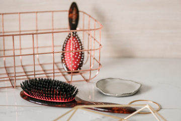
Haircare must-haves for mom
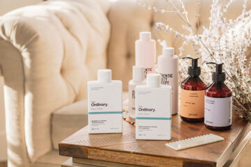
Ideally, I think moms and other caregivers deserve a monthly spa day—but a more budget-friendly choice are these haircare products from The Rootist. Your hair starts to thin out as you age (or, if you’re me, after you’ve spent a decade on methotrexate), and these strengthening products are designed to help combat that.
The Rootist’s Shampoo and Conditioner (each at Sephora) are formulated as concentrates. You’re meant to use half the amount of product with them that you would normally need. If you’ve been using low-end products, I think that’s true—but honestly, as someone who’s been hooked on Authentic Beauty Company for the past few years, I find myself using a fairly comparable amount of product. The Rootist’s formulas are lovely nonetheless and smell incredibly spa-like; I’m just going through them a little faster than expected. I’m particularly interested in the brand’s AHA+ACV Pre-Shampoo Scalp Clarifying Rinse (find it here). I don’t have anything else like it, and it’s great for getting rid of scalp build-up.

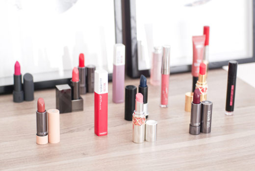
Fun mom gift ideas: My basics
I am neither fun nor a mom, but I have these products on me all the time. So, let’s finish up with them—they make great mom-gifts!
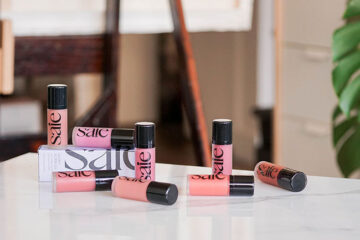
The first is the new Saie Beauty Slip Tint Radiant All Over Concealer (available at Sephora). This gorgeous, creamy formula builds and blends beautifully. It has a cushy applicator and a skin-like, glitter-free finish.
I’ve read that the Slip Tints lean pink, but as someone with fairly olive/green undertones, I haven’t had that issue with shade 2. Expect medium coverage with this formula. To build, use a dense brush to stipple in the product; don’t wipe at it. Saie recommends their Double Brush for this concealer; I like the small end of it for spot coverage, but as I like a little more coverage out of my concealer, I prefer their Powder Brush for this formula overall.
Another must-have is, of course, the classic Laneige Lip Sleeping Mask (find it at Sephora). I’ve been looking for a more cost-effective lip mask than this one for years and have yet to find one. It’s pricey, but it’s huge—which makes it perfect for moms. (Because, as we all know, the second a mom has something… Her progeny* wants some, too.) My most recent Lip Sleeping Mask is Gummy Bear, which is my favourite scent so far.
Have you bought your mom something for Mother’s Day yet?
—
Disclaimer: The products mentioned in this post were submitted for editorial consideration only. Except the lip mask — someone please tell Laneige that I love them.
*Fun fact: My mother has taken to calling me her “descendant” since I came out of the closet. 10/10; no notes.