Have you ever noticed that beauty brands, at some point in time, all seem to have collectively decided that certain colours mean certain things? It’s like some overfunded marketing department went, “hey, you know what sounds like fun? Bringing in an unqualified psychologist to tell us the true meaning of life and colours sounds like fun!” And everyone else followed suit.
It’s like that prison experiment: painting the walls pink made everyone calmer, but it wasn’t because pink is a gentle colour. (What was it said to be before the male to female changeover, again? Strong, bold, assertive?) The change just broke up the listless monotony of one identical day after the next, and even as a prisoner, it’s kinda nice when someone gives a crap about your environment. The same effects can be seen if you paint the walls red, yellow, fluorescent green…
Okay, maybe not fluorescent green, but that’s only because it’s impossible to maintain a pleasant disposition when the walls are literally (figuratively) screaming at you while you sleep.
The thing about these arbitrary industry colours, though, is that despite all the hogwash, they’re pretty helpful little guiding tools.
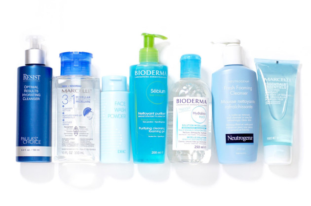
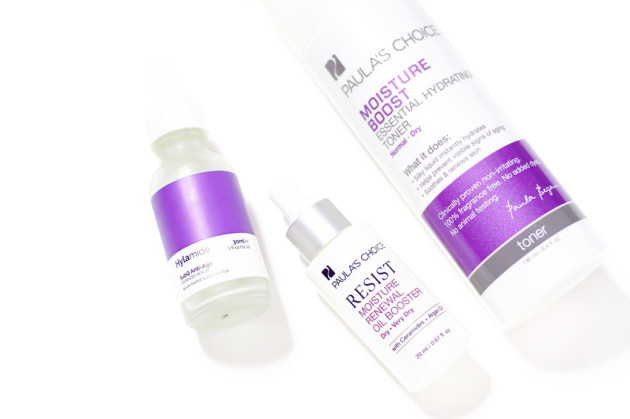
I like knowing that blue means cleansing, and that purple means anti-ageing, and that orange means that something is going to contain vitamin C and use the word “invigorating” or “energizing” at least twice on its packaging. It’s probably also going to smell like citrus, and I will surely try to taste it some point and no matter what, it’s going to be revolting.
I like that kind of reliability. I mean, I never learn from that kind of reliability, taste-wise, but I like knowing that it’s there all the same.
[show_shopthepost_widget id=”1782551″]
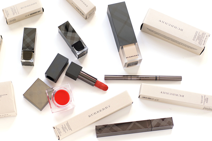
Funnily enough, this is a phenomenon that I think is strongest in mid-range and drugstore brands. Trendy high-end brands are too busy being coherent and classy, you know? Like, they are not going to break that aesthetic just so a consumer will immediately reach for their skintype’s “colour,” and they don’t need to – the sales associate is there to guide the consumer anyways.
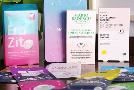
But for drugstore brands? This colour-coded nonsense can actually be pretty helpful, especially in a barrage of twenty other near-identical products. I think it’s kinda handy, like a weird life boat that nobody wanted but everybody is going to use anyways, because this ship is going down.
