After weeks and weeks a few days of deliberation, I decided to start with “the setup” as our first “tips for beauty bloggers” post. There are a ton of things that I’d like to cover, from exposure to focusing to blur brushes and healing brushes and unicorn brushes* and cameras, but this one seemed to be the most general… so we’re starting with it.
Disclaimer: the posts in this series reflect my own views on photography and Photoshop. There are about a million and five ways (that’s a real statistic, that is) to do any of these things, but these just happen to be the ways that I, personally, like to do them. So please, please, please – take everything with a grain of salt!
Alright. So I understand that you can shoot on (literally) anything, whether it’s a bathroom countertop or a rhinoceros’ back. But here’s the thing: you really, really shouldn’t. Chances are, the rhino will eat your pretty new lipstick, and the shot will be ruined.
Here are a few lists of backgrounds to consider – there should be something in there for everyone!
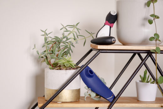
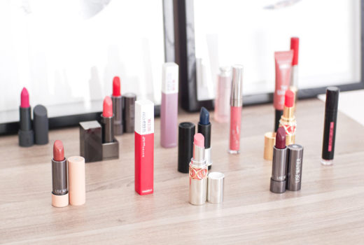
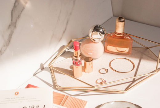
If you’re shooting… something small
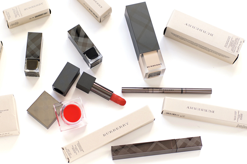
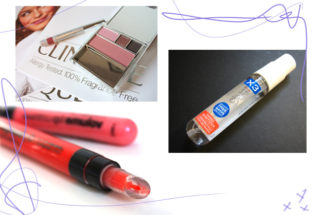
– A white tabletop is my first choice, though a black tabletop or a large piece of white or black bristol board are also good options.
– A standardized background, like a bed of rocks, wrapping tissue, or grass. I’m not a huge fan of this, because I think it tends to distract from the product, but some bloggers manage to make it work!
– A press release: simple, relevant, and easy.
– Your cat! That is, if he or she will stay still long enough… (kudos to Karen at MABB for putting it into practice and bringing it onto everyone’s radar, of course).
If you’re shooting… something standing
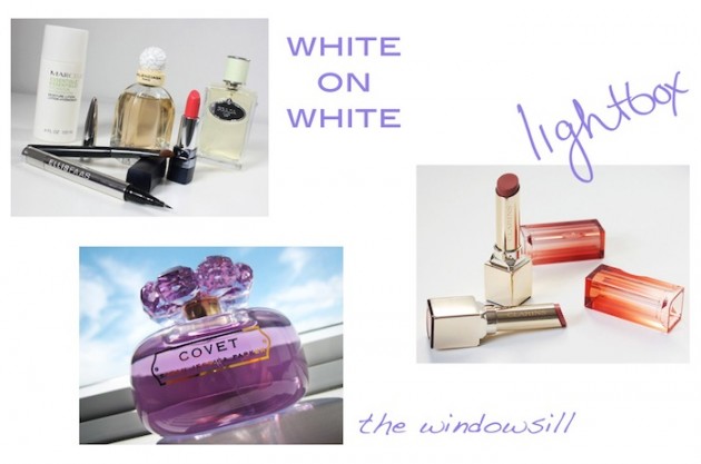
– A lightbox. This allows you to stand up your products and maintain an “infinity effect,” not to mention that it helps with lighting! (And speaking of lighting – we’ll talk about lightboxes more when we post about it, and perhaps share a DIY.)
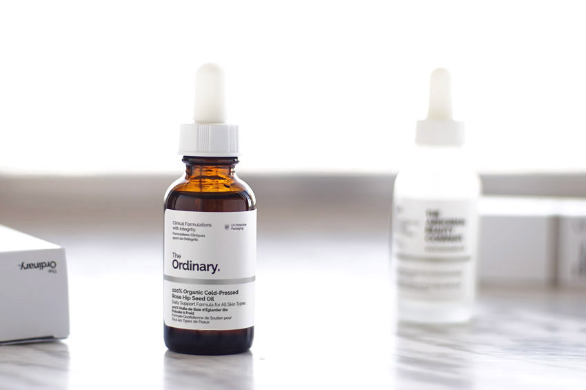
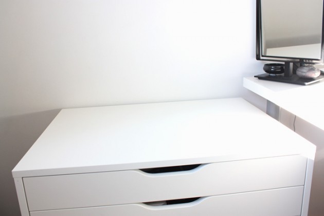
– A white surface and a white wall. It doesn’t have the lovely seamlessness of a lightbox, but is the next best thing!
– A clean window ledge. Mine aren’t flat so it isn’t usually an option for me, but Karen does a lovely job with this if you’re looking for examples.
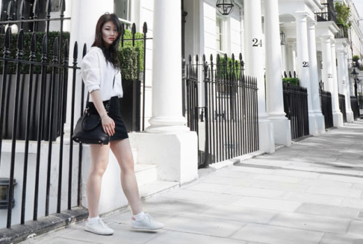
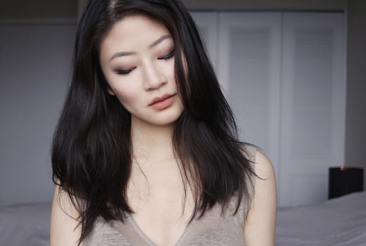
If you’re shooting… a face
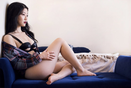
– White-backed curtains! I cannot stress enough how absolutely amazing these are. Not only do they create a single point of focus (your face), but they basically create a giant lightbox. The result? A ridiculously flattering photo, every time.
– Tee hee, the twelve-year-old in me is quietly gleeful over being able to use “your face,” on its own, in a non-offensive manner.
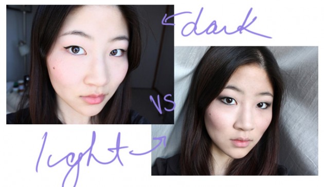
– White walls – best if you shoot with flash support, as there are very few walls that are close to windows, and optimal for medium to dark skintones to make your face really “pop”
– Dark backgrounds – best for fair skintones and/or hair colours… but don’t attempt if your camera is really low-contrast!
– Light, light, light. This is a hard one to get right, consistently, but it can lead to just the most divine images. This is as close as I’ve gotten, but damn, I’d love to figure it out!
A few of my pet peeves
– Messy backgrounds and bathroom countertops. Whether or not you throw your clothes on the floor is your business, but splashing it all over the internet? Unprofessional, and potentially embarrassing!
– FOTD shots taken in the car. Just… all over, no. Whether you’re a passenger or the driver (!!!), it always either freaks me out or creeps me out. It’s not that hard to wait a couple minutes and take it when you get out!
– Dirty products. I know, I know, it’s not a surface, nor is it a background, but I had to at least give it a mention! If you’ve already used the product, take a minute to wipe away any astray product with a tissue or q-tip. It’s always, always worth the extra effort.
Any more tips? Questions? Hit us up in the comments! I still have a plethora of topics to cover, but… all in good time ;)
