Follow:

    I’ll take a little Milk with my hand cream, please | L’Occitane Bonne Mère Gentle Cream with Milk

    The product: L’Occitanne La Bonne Mère Gentle Cream with Milk

    L’Occitane’s new La Bonne Mère collection pays homage to “the Good Mother,” the embodiment of kindness, generosity, and softness to the L’Occitane family. In Provence, the phrase «Oh Bonne Mère!» is used to express surprise, relief, and kindness, and remains an important influence on the soapmakers and scentmakers in Marseille.

    Available in two scents, milk and honey, the product range covers a few basic face and body products. The collection launched this August, and the packaging is made from at least 95% renewable, plant-based plastic — so not only is the range pH-balanced and gentle enough for the whole family (aged 3 and up), it’s easy on the environment, too.

    The scent: The La Bonne Mère Gentle Cream with Milk has a soft, powdery fragrance — less scented than many of L’Occitane’s other products, but still noticeable. With top notes of cotton flower, sweet heart notes, and a milky base enriched with white mallow milk, the products are meant to be calming and soothing.

    I haven’t tried the Honey range, but it has top notes of almond blossom, heart notes of golden honey, and a base of linden and orange blossom, which sounds absolutely delicious.

    The Gentle Cream: Intended for use on the hands, body, and face, the Gentle Cream is packaged in a portable 75ml tube. With an easy-to-use twist cap (I’m a sucker for products that don’t have finicky, separate lids), it’s brilliant for use as a hand cream — the rich, smooth formula sinks in quickly and leaves a soft, sweet-smelling finish.

    My sister’s comment on the packaging? “Oh my god. That’s so smart; why isn’t everything made like that!” My thoughts exactly

    The verdict?

    I hesitate to recommend this one, but it’s not by any fault of the product — rather, L’Occitane has another hand cream launching this October that I’m even crazier about! (Which is nuts, because I thought I was crazy about this one up ’til a week or two ago.)

    For a rich, milky-sweet cream that works brilliantly on the hands (both in formula and packaging), don’t miss the Bonne Mère Gentle Cream. And, hey: if you try it in Honey, let me know what you think of the fragrance!

    Keep reading! »

    Share:

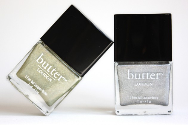
    butter LONDON Trustafarian review, photos, swatches

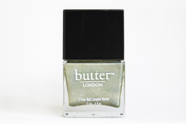
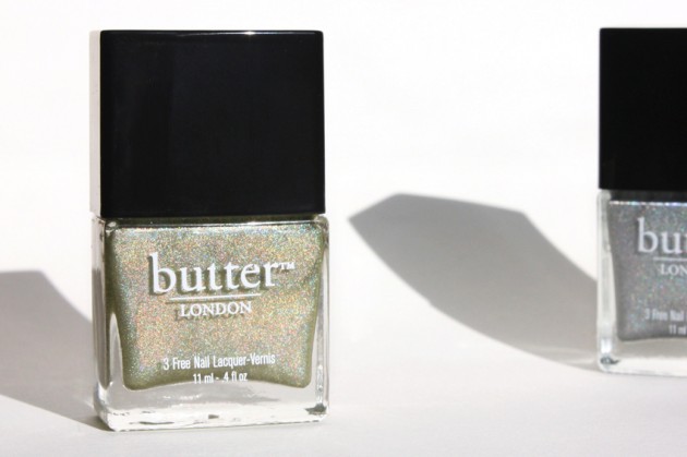
    The product: butter LONDON 3 Free Nail Lacquer in Trustafarian

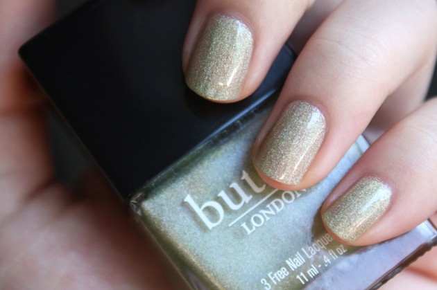
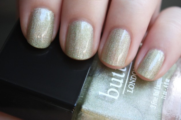
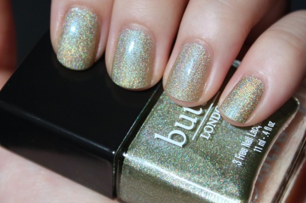
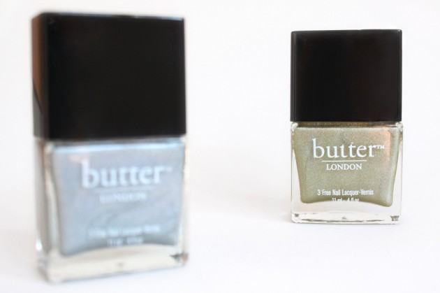
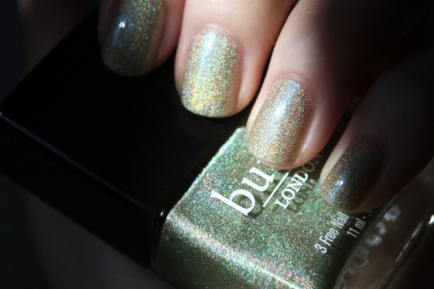
    The shade: Trustafarian, the other holo from butter LONDON’s Autumn/Winter 2012 collection, is an interesting yellow-green with holographic reflects. While I found Dodgy Barnett gave off more of a holo impression in indoor lighting (tungsten, fluorescent, etc.), Trustafarian seemed to flash back more of a rainbow in the sun (and in indirect sunlight.)

    Slightly more dense but almost identical in particle size, I find Trustafarian needs two solid coats to wear around — any less and it looks unfinished, rather than faerie-like (as was the case with Dodgy Barnett).

    butter LONDON Trustafarian swatch – indirect sunlight

    butter LONDON Trustafarian swatch – direct sunlight

    Like Dodgy Barnett, I found the particle size of Trustafarian to be, larger than what I’d expect from a holo. I personally think it makes the shade more interesting, if anything; it looks like a chunky shimmer at first glance, but still flashes with a holographic rainbow when the light hits it at an angle.

    Here’s the catch, though: All in all, though, I found Trustafarian to be extremely unflattering on my nails, its strong yellow-green undertones making my skintone look rather ill and alien. It might be due to my own olive/green undertones, but I think it’s just a hazard of the shade — unique as it may be, it has a tendency to pull a little sickly.

    Strangely enough, it makes me think of something by a brand like Illamasqua, not butter LONDON — something that’s interesting and a bit strange, but not necessarily flattering.

    The verdict?

    If you’re a fan of yellow-greens and light chartreuses, don’t let me stop you from getting this one. If you’re trying to choose between this and Dodgy Barnett, though, definitely give this one a skip. It’s a good formula, and an interesting shade, but I’m really not fond of it on my nails.

    On its own (as a theoretical colour), or perhaps on someone with strong beige/pink undertones, I think I’d like it quite a bit more. Trustafarian is a lovely, obscure shade, but it’s perhaps less wearable than you might initially think.

    (For formula and availability details, check out last week’s Dodgy Barnett review. For the full butterLONDON A/W ’12 collection details, though, follow through that second link.)

    Keep reading! »

    Share:

    Don’t miss this » Keira Knightley-inspired Anna Karenina (19th century Russian) makeup

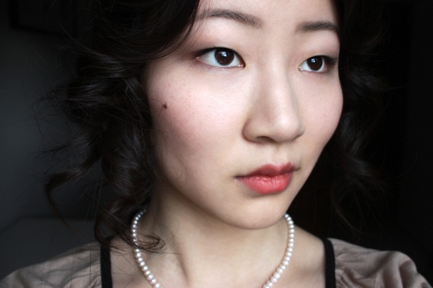
    Today’s makeup look is an Anna Karenina one, based off the upcoming Kiera Knightley film. Which, while I enjoyed doing it — how on earth are you supposed to emulate a no-makeup look (the actual no-makeup sort of no-makeup, not the modern “natural makeup” take on it) done on one of Hollywood’s most haunting faces when you look like… this? And write a makeup blog?

    Not that there’s anything particularly wrong with my face, but you have to admit: it’s neither very Kiera Knightley nor very 1800s Russian. And I’m definitely not a strong-browed Russian beauty who’s going to do nothing more than pinch her cheeks for a bit of colour.

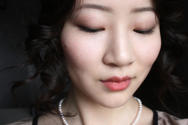
    All that taken into consideration, I really do love how these photos turned out, and I was quite pleased with the makeup itself! I mean, I think it’s passably Russian, on a face that’s very much not. And acceptably 19th century, I suppose.

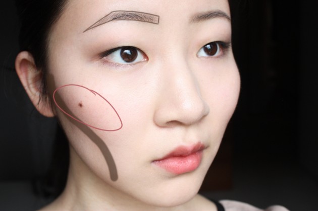
    Using a small brush (it’s actually a ridiculously large eye brush; the old, discontinued MAC 225) and a matte brown eyeshadow (Senna Sphinx + Smashbox Smoke), I shaded my brows outside the natural line, contoured under my cheekbones and down the… jowl-y area of my face, and added a very natural, completely matte brown lid for definition.

    Then, to pair with the contoured face and strong-but-natural brows, I used a warm, cream-finish brick-red lipstick (Marcelle Provocative) to stain my lips, and added a warm liquid lip colour (LUSH Perspective) to my cheeks, for a slightly ruddy look. More on the lip colour soon — I’m really not loving it on my lips, but they’re more than passable as liquid blushers!

    Colour placement guide

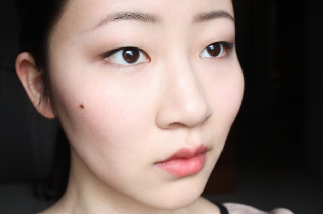
    (& without the lines and loops)

    All in all, this look was more or less put together with a bunch of colours that I wouldn’t typically use, paired with hair that I wouldn’t typically wear, and finished with brows that I wouldn’t typically be able to pull off.

    But that’s… kind of why I enjoyed doing it so much, you know? This is the sort of makeup that makes makeup fun; working your way outside of the box and into a different era (and, er, ethnicity) altogether. (Also, a fictional character; what other careers and hobbies will let you attempt to emulate or draw inspiration from a fictional character just because?)

    (Not lawyering or accounting or science-ing, that’s for damn sure. But maybe doctoring, because– oh, gosh, okay, I’ll stop making bad puns and let you get on with your day.)

    For a full tutorial of this look, don’t miss this post on She Said Beauty.

    Keep reading! »

    Share:

    butter LONDON Dodgy Barnett review, photos, swatches

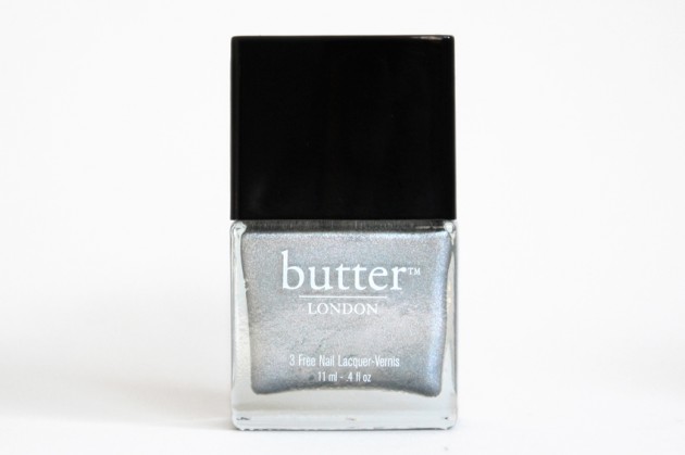
    The product: butter LONDON Nail Lacquer in Dodgy Barnett

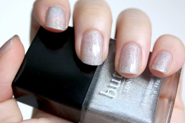
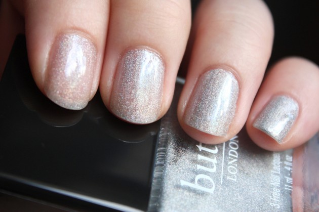
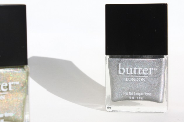
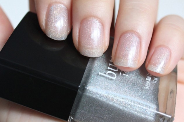
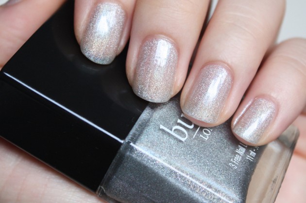
    The shade: Dodgy Barnett, one of the two holo polishes from butter LONDON’s A/W 2012 collection, is comprised mainly of silver holographic shimmer in a clear base.

    The shimmer density is quite versatile; one coat delivers a see-though veil, two coats deliver a more solid effect. Three coats are fully opaque, but I think two thin layers is perfect for this one — there’s just a bit of translucence left there, which makes it a bit less intense; a bit lighter (both visually and from a tactile standpoint.) The image at the top of this post is two layers, in case you’re curious!

    butter LONDON Dodgy Barnett swatches; 1-4 coats moving from index to pinkie

    Possible dupes: Call me a nail heathen, but I generally feel like one silver holo’s the same as the next. Check your stashes for something similar — I know China Glaze and GOSH do silver holos (OMG and Holographic, respectively) that look to be a little more finely-milled, but I’m kind of partial to the particle size of this one. It’s not a “true” holo in my opinion, but more of a holo-glitter cross.

    Try something like Milani 3D Holographic in HD for a comparable drugstore dupe — it has chunkier shimmer, but it’s 3-free, permanent (Dodgy Barnett is limited edition) and just under $5. I don’t own HD, but Kelly at Vampy Varnish has some lovely swatches of it!

    butter LONDON Dodgy Barnett Nail Varnish – direct sunlight

    The formula: This is the first butter LONDON polish I’ve worked with, but can I just say that the formula is (as expected) absolutely lovely? I’m used to polishes that you can just pick up on the fly at the drugstore, but Dodgy Barnett goes on smoothly and quickly, settling easily into an even, streak-free finish. 

    Additionally, I find the thin layers dry nicely–no shrinking or super-long wait times,– and the 3-free, paraben-free formula is just a nice cherry on top, rather than the only selling point.

    Just one (sheer) layer of Dodgy Barnett

    Nail swatches of butter LONDON Dodgy Barnett (two coats)

    The verdict?

    As much as I love Dodgy Barnett, I can’t say that–as someone who wears nail varnish very, very rarely–I’d pay quite this much for it. I received my bottle from Nail Polish Canada, who have the collection for $17 each (plus free shipping!), which is on par with the butter LONDON site.

    All that said & done, though? For my first foray into the lineup, I was quite impressed. I still think the particle size is a bit too large for an intense, solid holo effect, but (shh, it’s an open secret) I actually kind of prefer it.

    I’m actually tempted to wear this one around, which is a first — I haven’t done my [finger]nails just because in five or six (or seven or eight) years. For theNotice, yes; for myself, not even once!
    Ingredients & layered swatch photoes »

    Share:

    COMING UP | butter LONDON Autumn/Winter 2012 collection reviews

    I have Trustafarian and Dodgy Barnett to share with you this (and next) week, but more on that in a few! Here are a few quick collection details — I was going to add them to today’s post, but it was toeing the line between “long” and “definitely too long, oh my god, calm it down.”

    You’ll thank me later (or not… I have a sneaking suspicion that I tripped over that  line by a long shot anyways.)

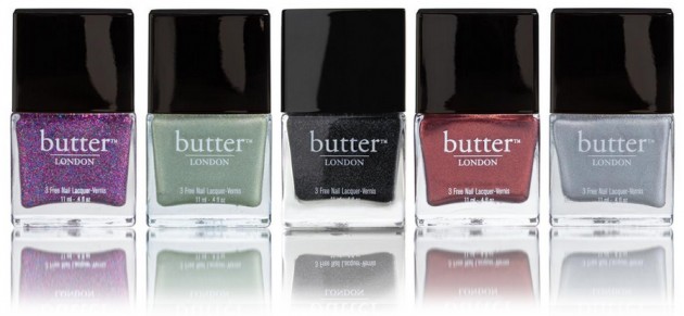
    butter LONDON Autumn/Winter 2012

    It’s rather difficult to describe polishes you don’t own, so I’ll let butter LONDON take it from here!
    Lovely Jubbly: Brit speak for “Excellent.” Used when a person hears pleasing news or has a stroke of good luck.
    A vibrant magenta flecked with red, blue and gold micro particles. 

    Trustafarian: A spoiled rich kid who pretends to be a hippy but still goes home to Daddy’s mansion on the weekend. 
    A golden holographic finish gives this delightful sage green a surprising and sophisticated edge. 

    Gobsmacked: To be totally speechless. Unable to think of anything to say.
    A heavily pigmented charcoal grey glitter with a slightly textured finish. 

    Shag: Brit slang for “knocking boots.”
    A high-shine metallic lacquer in a warm orange-burgundy hue. 

    Dodgy Barnett: A bad hairdo. A mullet of any variety is a seriously Dodgy Barnett.
    A highly holographic shade that blurs the line between grey and silver.

    Share:

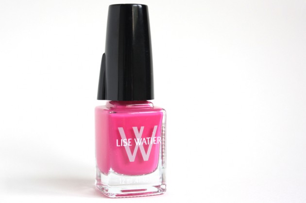
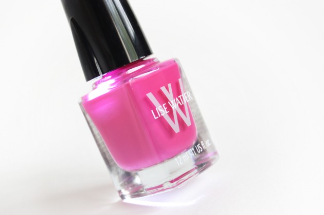
    Lise Watier Light Up Cap Nail Lacquer in Dragon Fruit: review, photos, swatches

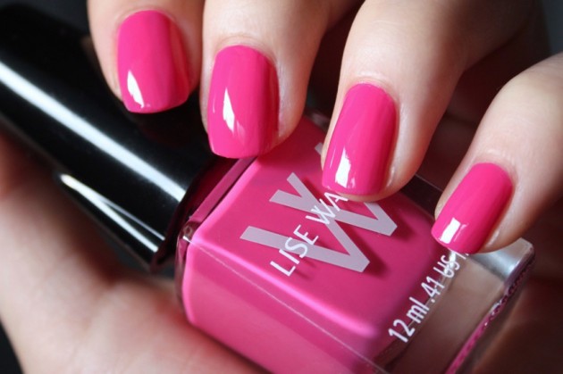
    The product: Lise Watier Nail Lacquer in Dragon Fruit

    I’ve been a bit remiss in posting about the Lise Watier Summer Sunset collection, and (with summer ending,) I thought I ought to finish my reviews as quickly as possible. I didn’t see the collection the last time I was in a Shopper’s, but this polish is still available on the LW site, so you should be able to get your hands on it with relative ease.

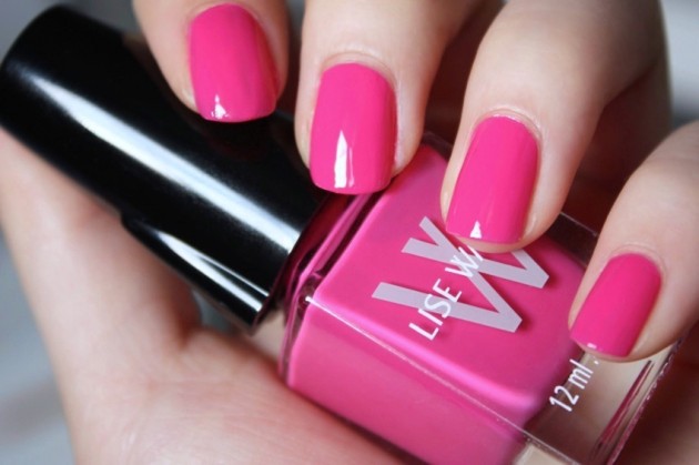
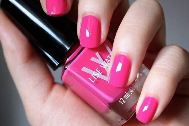
    The shade: Dragon Fruit is an intense, blue-based bright pink — not for the faint of heart. With a gorgeous cream-finish formula and a medium (rather than light) hue, it’s more of a statement colour than a delicate, girly shade. I’ve never been much for pinks, but for a bright, punchy nail, this one’s not half bad: it certainly has teeth!
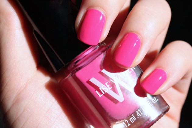
    Lise Watier Dragon Fruit Nail Varnish swatch – indirect sunlight

    Lise Watier Dragon Fruit Nail Varnish swatch – direct sunlight

    The formula: I was a bit wary of a shade this intense (and in a cream finish, no less), but the Lise Watier Nail Lacquer formula? Doesn’t disappoint.

    Opaque in two coats, I found this formula to be ridiculously easy to apply — just the right consistency, it settles into a smooth finish without any coaxing and dries relatively quickly. I do tend to like a thinner formula, where you don’t have to worry about gloopiness (totally a word) or streaks or waiting between coats (aside from doing your four other fingers or nine, as it were, because… two hands), and this one was just right. 

    No streaks, no clumps, no need for more than two coats; even for a mid-range price point ($12.50), this one gets a gold star in my books.

    The packaging: Okay, so my one peeve with this product? Light-up caps, ugh. I’m really not a fan of the whole let’s put LEDs on everything! trend, but for the formula, I’ll give it a pass. The light-up lid is perfect if you’re bothered by your polishing hand casting shadows on your being-polished hand, and at just 50 cents more than the non-lit Lise Watier polishes, it’s really not a huge problem for me.

    (Plus, despite that I’m anti-LED, lights in nail varnish caps actually makes sense. Unlike some other products.)

    The verdict?

    I’m not sure about tip wear and chipping over time, but from what I’ve seen of Dragon Fruit so far, I’m impressed. The Lise Watier Nail Varnish formula is a solid one, at least in this shade, and it applies easily and smoothly with good pigmentation.

    Plus, Lise Watier should get bonus points for making their polish more attractive than the actual fruit… though it does lack in points for weirdness! ;)

    Keep reading! »

    Share:

    Don’t miss this » Graphic blue smokey (cat) eyes

    Man, I haven’t done a blue smokey eye in ages. I’m pretty sure I went with a winged shape (cat-eye makeup, winged smokey eyes, whatever you want to call it) last time, too, which just goes to show how predictable (read: boring) I am.

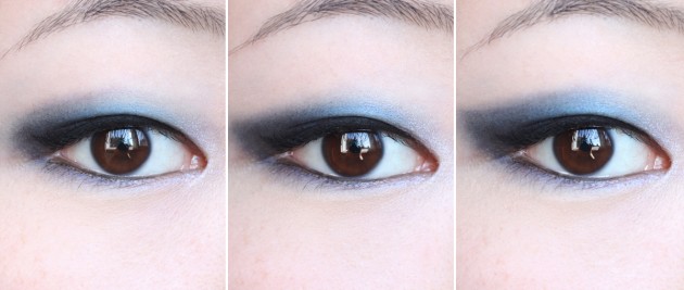
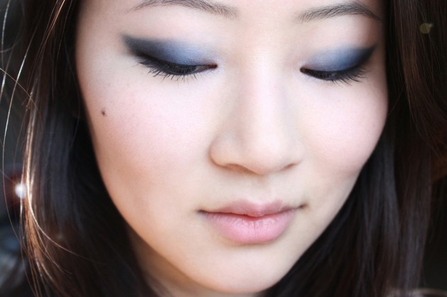
    This time, though, I thought I’d play around a bit with shape. In the image below, you have the same look in three different ways, changed with nothing more than a dry q-tip and a couple brisk buffing motions. At left is the most wearable, basic shape; on the far right, the most winged, dramatic effect. (The full-face shots are with the eye on the right.)

    I can’t believe it took me this long to try my MAC Casual Colour — I spend most of the summer bare-faced, but I’m really regretting it in this one instance. I’ve used Have A Lovely Day! here, and I’m absolutely smitten with both the colour and the formula: it’s comfortable, looks natural, and still manages to tone down my own lip colour without ending up all strange and milky.

    I’ve used Senna Fantasy in the inner corners, here, then taken Annabelle Lagoon (soon to be discontinued) through the lid. The outer wing is mainly Annabelle B-Ray, darkened further with a basic matte black eyeshadow.

    Don’t miss this blue smokey eye tutorial on She Said Beauty.

    Products used

    EYES – colour : Annabelle Mono Eyeshadow in B-Ray and Lagoon, Senna Eye Shadow (Glow) in Fantasy, NYX Eyeshadow in Black.

    EYES – basics: Annabelle Smoothie Jumbo Eye Pencil in Licoriche, Clinique High Impact Extreme Volume Mascara in Extreme Black, Ellis Faas Eyeliner in Black, MAC Eye Shadow (Matte2) in Blanc Type.

    LIPS AND CHEEKS: MAC Casual Colour Lip & Cheek Colour in Have A Lovely Day!

    SKIN: Hard Candy Glamoflauge in Light, theBalm timeBalm in Lighter Than Light, and Marcelle Face Powder in Translucent.

    Share:

    DUPE ALERT: Check your stashes for… | Vasanti Mount Rushmore vs. MAC Whims & Fancies Eyeshadow Duos

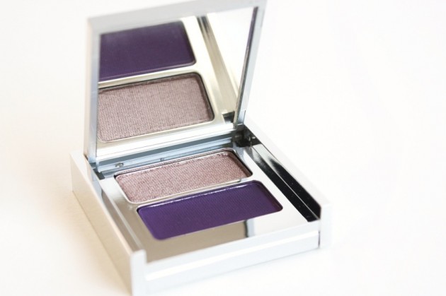
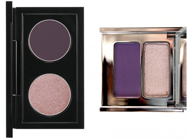
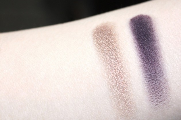
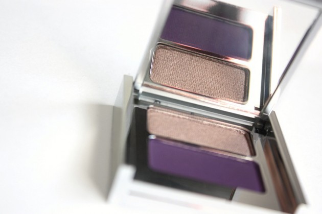
    Remember this Vasanti Eyeshadow Duo review? Back when I first swatched Mount Rushmore for you, I couldn’t find anything else on the market quite like it — a sooty, plummy matte violet paired with a shimmery, silvery taupe, it was a pretty unique duo.

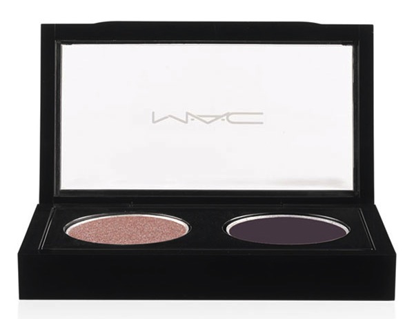
    And it still is, of course, but I couldn’t help but think Mount Rushmore! when I saw the new MAC Whims & Fancies Styleseeker Eyeshadow X2.

    Whims & Fancies is limited edition with the Styleseeker collection, retails for $33 CAD and contains two separate eyeshadow pans: Performance Art and Shadowy Lady.

    Mount Rushmore, on the other hand, is permanent in the Vasanti collection and retails for $20 CAD, albiet presumably for less product overall. Both products are paraben-free.


    L: MAC Whims & Fancies Eyeshadow Duo / R: Vasanti Mount Rushmore Silky Eyeshadow Duo

    Vasanti Mount Rushmore Eyeshadow Duo swatches

    I can’t speak toward an exact shade dupe, but from what I’ve read about the quality of the Shadowy Lady in Whims & Fancies — if you’re in Canada and you don’t have either yet, go for Mount Rushmore. And if you already have it? Feel free to skip this Styleseeker duo!

    P.S. If you’re in need of swatches and reviews for Whims & Fancies, check out these posts on Temptalia and Beautezine.

    Share:

    A Wednesday ramble: Tom Pecheux at Estée Lauder, Molton Brown Aroma Rocks, and the elusive Erika F

    Have I told you about my enormous crush on Tom Pecheux? Or, more specifically, on his talent? (Hint: the answer is yes; I talk about my unhealthy Pecheux-fixation on a fairly frequent basis.)

    Pecheux, who had initially intended to be a pastry chef (seriously!) started out doing fashion shows, then moved onto celebrity/celeb editorial makeup, and finally ended up working for L’Oreal, Shiseido (did you know that he devised the Shiseido The Makeup line?) and–currently–is at the forefront of the Estée Lauder makeup line.

    “I want young girls to be able to say, ‘My mother loves it, my grandmother loves it, and I love Estée Lauder, too,'”

    – Tom Pecheux (as quoted in)

    I’m crazy about a lot of things, from cartoon whales to neuroanatomy, but rebranding is close to the top of the list. Since they signed Pecheux in 2009 as their new Creative Makeup Director, the brand has had such a drastic revival. And, while I still (!) haven’t gotten around to really giving their new products a spin, I’m thoroughly enjoying watching the rebranding in real time.

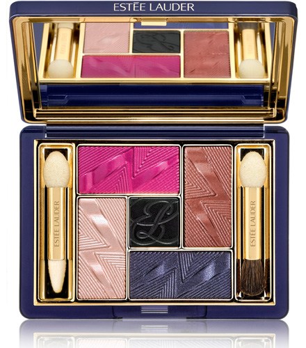
    (And herein lies the origins of this ramble: have you seen this fall’s Violet Underground palette? Gah.)

    Other things that have been knocking around in my brain this past week: things in unexpected formats. I briefly mentioned Donna Karan’s Cashmere Mist ‘Pearl Essence’ Bath Beads earlier this week, and Tatcha’s Rice Enzyme Powder the week before that, but I’ve been keeping an eye out for innovative formulas ever since.

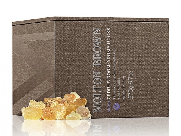
    I did find some interesting textures, but in the last place I’d have expected: Molton Brown, a brand that focuses mainly on home and personal fragrance. How cool are these Cedrus Room Aroma Rocks? Made of acacia tree sap, Moroccan cedrus tree oil, and Bulgarian lavender oil, they’re one of the last things I’d have expected to run into at the start of the week.

    (And as a sleep aid; how cool is that!)

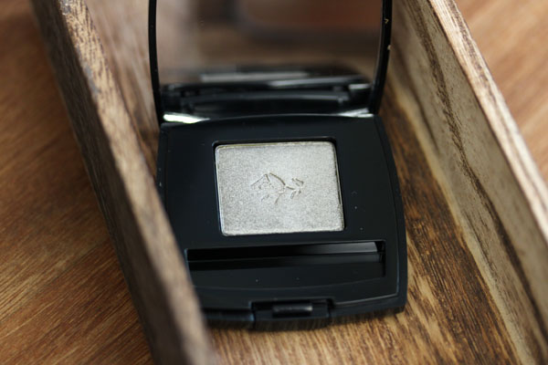
    Finally, we have Lancome Erika F, because things are best done in threes, and I’ve really only gone over two topics so far this morning. I need your opinions, my dear readers: is it a must-have? Because I’m not one for cult products most of the time, but everyone seems to be crazy about it, and… the recurring frenzy kind of makes me want to search it out.

    I don’t even like silvery-greens most of the time, you guys. Make it stop! 

    (Image via the gorgeous Xiao, at Messy Wands — read her ode to Erika F here.)


    Note: This post contains a few sponsored links, but the content — you should know by now; that nonsensical ramble’s all mine! 

    Share:

    The Dark Eyeliner Rises | An Anne Hathaway (as Catwoman) makeup tutorial + look

    Because Selina Kyle is a BAMF.

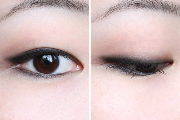
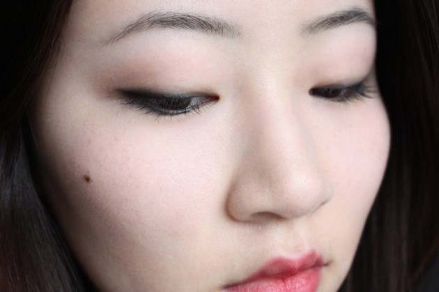
    In a few more words, though: here’s a quick look (tutorial + more photos here) to make up for the fact that I’ve been AWOL recently. Soft red lips, matte neutral eyes, and (what else?) smudgy winged black eyeliner.

    While editing these photos, I realized that I look rather… displeased with the entire world in them, which — not intentional, I promise. (Okay, maybe a little bit intentional. It has been so hot in Edmonton this season; I am so, so ready for the fall.)

    Honestly, though? This look isn’t exactly prototypical DC superhero — you could get away with wearing it in pretty much any scenario (no ass-kicking or taking of names required). Take the edge off a red lip by applying your lipstick quite sparingly, and then blotting it down with a fingertip for a really soft, lived-in edge.

    (Alternately, wear the lipstick full-force for a more dramatic, evening look, or grab a classic-red gloss–with shimmer!–for something a bit more fun.)

    Alright. I’m sure you’ve had enough of my boring face for the time being, so I’ll add in one last note and then leave you be!

    Black liner through my sparse lashes is my #1 makeup tip for looking just… better, without making it obvious at all that I’ve actually got anything on, and this liner does a fantastic job of it. More awake, larger eyes, more expressive, you name it — liner in my actual lashline (not above it, and not below it) is a makeup trick that I rely really heavily on, and this super-creamy, super-black Annabelle Smoothie pencil has been my pick of the month to do it with.

    Keep reading! »

    Share: