Follow:

    LORAC lemming swatches!

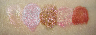
    I’m falling hard for LORAC‘s new Multiplex 3D Gloss. At $22US/$29CAD, I really wish I hadn’t seen these in the first place! You’ll have to enlarge the swatches to get my gist; the glitter factor and pigmentation is just stunning. I liked the formula (and the short brush-tip appicator) while swatching, and a friend of mine tells me they wear like a dream.

    Left to Right: Polished, Cliché, (Untamed was MIA, unfortunately,) 3D, Vivid, and Intermix.

    Quick descriptions of the glosses:

    Polished is the sheerest of the bunch; pearlescent salmon-pink shimmer on an almost-clear peachy base.
    Cliché looked like your typical baby pink (hence the name?) but actually turned out to be a very pigmented milky pink packed with white-blue shimmer.
    3D has a strange brown base, but it’s the most interesting gloss I’ve ever come across. Why? Gold and hot pink reflects, baby!
    Vivid is another juxtaposition, but is much less flashy than 3D. Lime reflects on a medium-pink base. Trust me when I tell you it’s fascinatingly pretty!
    Intermix, like 3D, is another shade that you’ll either totally love or totally hate. It makes me think of fire with igold reflects on a red-orange base.

    So — what do you think?? I’m majorly lemming Cliché and Vivid, but 3D is the one I’m dying to try on.

    Share:

    Tarte lipstain swatches!

    The title says it al! Swatches of the new Tarte Natural Lip Stain with LipSurgence Technology lipstains follow. (That’s not my arm, though — I have the accute inability to effectively photograph my entire forearm, so I used my friend’s arms. Thanks hon!)

    The basic details: each pencil is quite small, 0.08oz each, and they’re $24US/$31CAD. The bottom turns to push up more product, similarly to the cheek stains, and they do the same “sweating” thing if left alone for quite a while (or if they’re left in fluctuating temperatures for just a little while.)


    Ingredients: 

    Ricinus Communis (Castor) Seed Oil, Caprylic/Capric Triglyceide, Vegetable Oil, Candelilla Cera, Cera Alba, Hydrogenated Vegetable Oil, Castor Oil Bis-Hydroxypropyl Dimethicone Esters, Ozokerite, Simmondsia Chinensis (Jojoba) Seed Oil, Limnanthes Alba (Meadowfoam) Seed Oil, Mentha Piperita (Peppermint) Oil, Dimethyl Isosorbide, Stevioside, Salicornia Herbacea Extract, Palmitoyl Hexapeptide-14, Ascorbyl Palmitate, Tocopherol, Glycine Soja (Soybean) Oil, Red 27 (CI 45410). (+/-): Iron Oxides (CI 77492, CI 77499), Red 28 Lake (CI 45410), Red 28 (CI 45410), Red 7 Lake (CI 15850), Yellow 5 Lake (CI 19140).

     
    Above: The display

    Above: Joy, Amused, and Charmed

    Above: Moody, Lust, and Enchanted
    (With flash; the photos without it didn’t turn out.)
    Share:

    Open Door Policy

    I’ll be uploading some swatches later today (LORAC glosses and Tarte stains, anyone? Yah, swatches overruled my craving to review.) but until then, we’re trying something new. So…

    Until noon on Saturday, theNotice is open for questions!
    ETA: Submissions closed; thanks for all the great questions! See you in a month or so for another round ;)

    Feel free to ask anything in the comments of this post, from “I’m looking for a new non-sticky clear gloss, can you recommend something in the $5-10 range?” to “if you ran into Christian Bale RIGHT THIS MINUTE, what would you do?”

    (Answers: Victoria’s Secret Beauty Rush Minty Lip Shine, and probably pee myself.)

    Share:

    No, Rae.

    It would be wrong to throw yourself at Angie Hranowsky and force her to take you in as a) a long lost child, b) an apprentice, or c) a worshipper.

    (Are you sure? Are you totally sure? Because after checking out the latitude lane section of her interior portfolio, I think I need to become c) a worshipper.)

    Share:

    So I had a dream about a kitchen.

    Small. Perhaps twelve by eight feet in total. Dark chestnut cupboards and drawers on the entire perimeter; glass fronts to the upper cupboards. Almost like a fabrigée in its shape, but with sides rather than curves; in the center was a fixed island, its wood the same. Rich burgundy walls peeking between the counter tops and the upper cupboards and around the far side window, above a stainless steel sink sunken into the granite counter top — a moody sheet of blackened slate. Burnished bronze wrought-iron hardware.


    A tall room; twelve or thirteen feet. The cupboards ending around nine feet; above them shelves running around the entire room. Accessible by a rolling attatched ladder, the kind you would see in an old ceiling-to-floor library. Space at the top for pots, pans, china — and then the windows. Geometric, pentagons or hexagons outlined in the same dark wood and doming. Like the top of a diamond ring; faceted yet flat at the top. Clean light streaming through to make the kitchen’s comfortable warmth safe instead of claustrophobic. 

    Medium brown planked floors, each plank three or four inches, running the width of the room. Warmth radiating upward through its almost matte finish. The smell of the air like a welcome assault; soft. Vanilla. Amber. Leather. Gas from the stovetop and cedar from the fireplace in the next room over. 


    And the quiet, like it is waiting for me.

    Share:

    Splurge — the neutral shadows

    Ha! We haven’t done “Splurge” for such a long time on theNotice that I bet you forgot all about it! (Don’t lie. You totally did.)


    Anyhow; today we’re discussing neutrals, becase I definitely do think they’re worth splurging on. Now, we’re not talking crazy splurges, but $10-20 on a few good staple shades. Namely, two or three.


    The hilight
    This should be your lightest colour, and it’ll be different for each person — if you’re super pale, then reach for an almost-white shade, and if you’re a little darker, an ivory. The more contrast between your hilight and your skin, the more it will “pop,” so if you’re a fan of inconspicuous makeup, go for something close to your skintone and fairly matte! 

    For use on: the browbone, the inner V, or as a bright wash on a super-lazy (or super-late!) day.
    Matte or shimmer: either. A matte will allow for greater versitality, but I personally prefer a finely-milled shimmer with a satiny finish for my go-to.
    My favourites: Lancome Crème Lustré (my all-time fave!) and Moonstruck, Estee Lauder Tea Biscuit.


    The mid-tone
    This one’s more optional than the other two; with good blending you can certainly just get away with using two. However, if you want to take the extra step, getting a mid-tone to pop right in the middle of your lid creates gorgeous depth! I personally love gold-bronze shades for my midtoned shadows.

    For use on: the middle of your lid, or as a darker all-over wash.
    Matte or shimmer: shimmer, as it’ll make the mid-area jump out, adding depth to your eyes. Not crazy glitter city shimmer, of course, but more of a finely-milled, pearly shimmer.
    My favourites: Fyrinnae Polar Bear, Lancome Platinum, Senna Taupe Glow.


    The contour
    This will be your darkest shade, and will go closest to your lashline (horizontal blending) or in  your outer v (vertical blending.) Used wet, a good contour colour will double as a liner! Don’t go with black — instead, go for a darker brown or taupe.

    For use on: the outer v (vertical blending,) closest to your lashline (horiziontal blending,) or even as a soft liner used with a fine brush and/or used wet!
    Matte or shimmer: here’s another where I usually go with shimmer, but would recommend matte. Why? Simple: it’s easier to look like a mess if you’re going with shimmer! And if you do want shimmer but you have a matte, you can always pull some of the shimmer from your medium shade over.
    My favourites: Senna Twilight or Sphinx.

    That’s it — two or three shadows that are worth splurging on if you’re only going to have a couple in your kit! I know, I know, three shadows can ring up a bill anywhere from $30 to $90, but if you’re looking for reliable shades to use up completely, they’re worth every penny.

    Share:

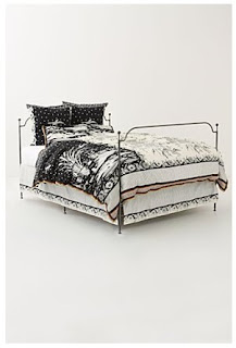
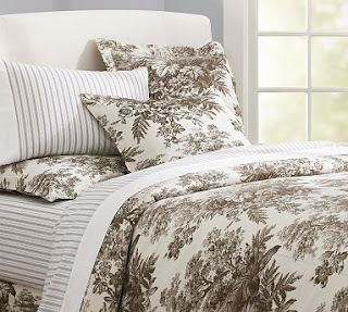
    In need of a new duvet cover.

    Any ideas? Even just for your favourite bedding sites — I’m bored with my solid navy (though I do love their incredible softeness) and would like a change, preferably something less dark and boring. If you do specify a specific item, please keep in mind that it needs to come in a twin and go with the rest of my room, namely my drapes!


    Things that  I like, but aren’t quite perfect:

    Share:

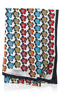
    The LOL (Liberty of London) scarf

    Okay, how ironic is it that the “Give Me Liberty of London” collection can be summed up simply as “LOL”?

    Case in point to prove the irony: the $95USD/$115CAD scarf. It’s not even that cute!

     
    I’m super-duper a little bit convinced that they’re just doing this to test the consumer — “how far can we go before someone notices?” First it was the (unfortunate looking) Viva Glam bags at $30, then the MSFs getting their price raise to $33.50, and now this.
    This is hideous

    (Yah, I’m heavy on the judgment today. But you can’t blame me; I have a stomachache and my throat’s feeling icky! Goodness, I hope I’m not sick again. I guess the scarf’s not that bad; it’s just not something I’d throw myself at.)

    (Like, ever.)

    (As in, not even if it was $10.)

    (Sorry MAC.)

    Share:

    Painted Love: Spring/Summer 2010 at Annabelle

    Single swatches and minireviews of each eyeshadow upcoming ;) Keep your eyes peeled for these — they should be hitting stores around the first week of March!

    (On a totally irrelevant note, what do you think of the word “eyeshadow”? One word or two, ie. “eye shadow”? I can never decide.)

    Clockwise starting with the pinkish red: Pinked, Helium, Toxic Garden, Nymphet

    And one more needless photo, just for the hell of it, because I happened to like the shot… 
    So: what do you think? Personally, I though I’d love Pinked and not really care for the others, but Nymphet was the one that made me swoon! It makes me think of a less crappy Too Dolly, or perhaps even a lighter Aquadisiac. As for Helium — my god, you’ll have to see that one in real life for yourselves. I was expecting another blah neutral shade to compliment the quad, but it’s actually a heart attack in a pan!
    Share: