The product: Hello Kitty Graffiti Eyeshadow and Blush Palette
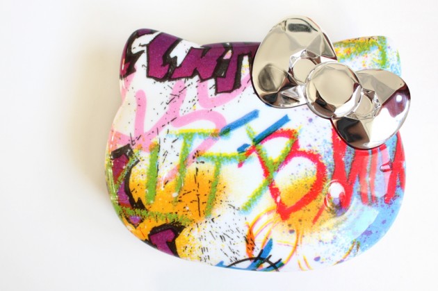
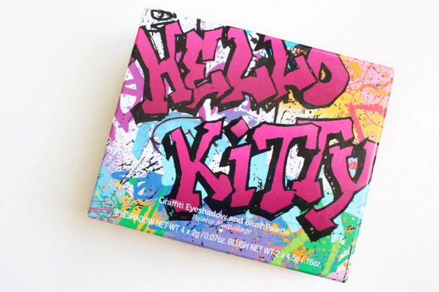
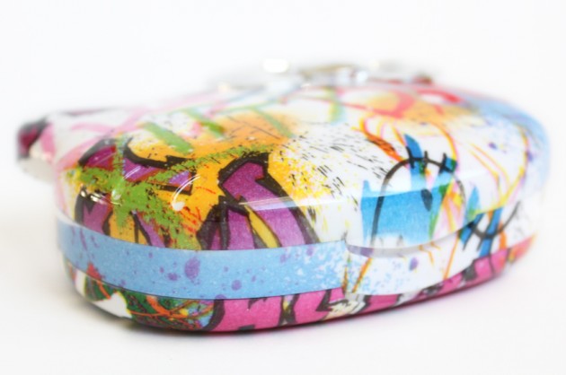
The packaging: Alright, so I’ll start with the packaging, because I’m a little love/hate about it. On one hand, I’m not twelve, I’ve never understood the Hello Kitty appeal, and I can definitively say that I dislike the graffiti-ness of the Graffiti palette*.
*Partly because I’m not big on random splashes and speckles of colour; partly because it “pays tribute to the daring artists who decorate Hello Kitty’s favorite downtown sidewalks.” I happen to disagree vehemently with the whole “defacement of public property is cool!” mentality, so.
(I mean, don’t get me wrong – street art is very cool, but only when it’s been encouraged and/or commissioned!)
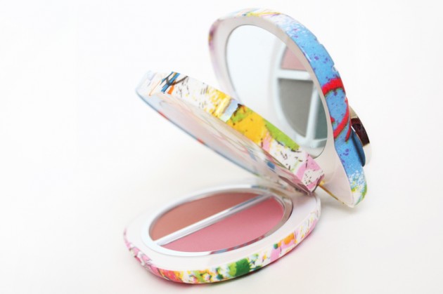
On the other hand, though, I like the solid build of the packaging, the bi-layer design, the inclusion of a mirror, and (dare I say it?) I’m even a little fond of the silver bow. Plus, each palette’s packaging is unique (compare this one to the Sephora stock image if you’re confused), which is quite cool.
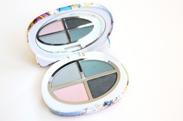
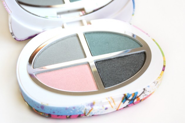
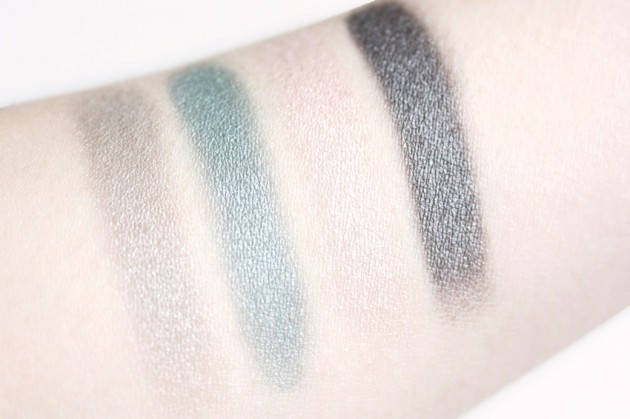
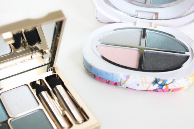
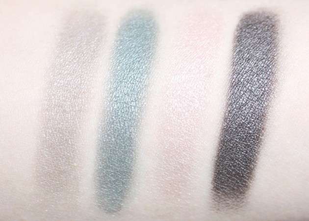
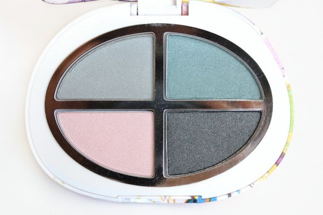
The eyeshadows: On the Sephora site, the four shades are listed as a shimmery gray, a greyish teal, a soft pink, and a charcoal. Unlike a lot of product listings, I’d say those descriptions are actually spot on, which is a nice deviation from the norm!
The shimmery grey is on the sheer side, with a watery, translucent vibe and a bit of taupe hidden in the shade. The greyish teal is a breathtaking, intense, slightly desaturated teal. (Aside: I’m really liking this “greyish teal” thing — here’s to hoping we see more of it in the next few months.)
The soft pink is the sheerest shade of the four, with wearable yellow undertones and a very low likelihood of making you look like you have pink eye. Finally, the charcoal is a deliciously pigmented, easy-to-blend dark grey.
All four shades are soft, blendable, even-textured and shimmery.
Hello Kitty Graffiti Palette – eyeshadow swatches, dry on primed skin.
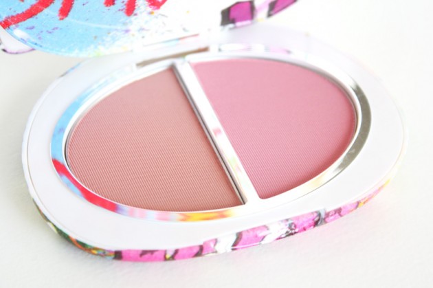
The blushers: I admittedly paid less attention to the two cheek products in this palette, but I can tell you that they’re really quite pretty. And I swear, whoever produced this palette got right into my brain when they did the finishes – the eyeshadows are just the right kind of shimmery, and the blushers are spot-on as well.
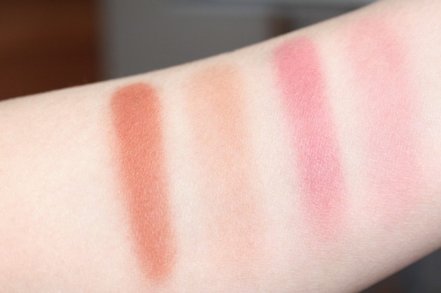
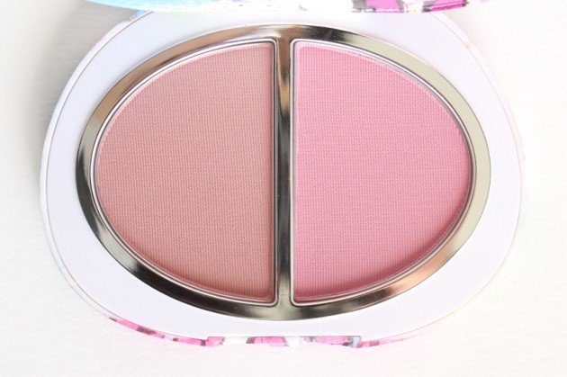
The shades are described as a bronzy peach (completely matte; think of a cross between a peach blush and a contour powder) and a dusty pink (that newfangled sort of matte – you know the one; where it’s matte but if you look really closely at the pan, you can see a few super-tiny bits of shimmer?).
And, well, yeah. They’re both kind of lovely; pigmented and smooth. Both shades are medium-toned, as well, so most skintones won’t have to worry about them showing up – they’ll be more obvious on lighter complexions, of course, but I can see them working on most.
Hello Kitty Graffiti Palette – blusher swatches; heavily then blended out.
The verdict?
You guys. You guys. This is perfect, absolutely perfect, for Spring.
I’m in love! I’m in love with a ridiculous-looking Hello Kitty palette and I can’t even bring myself to care because everything inside it is just so pretty!
On a more serious note, though, I was actually quite impressed by the quality of this palette – the shades are gorgeous, both individually and together, and the quality of each of the six (four eyeshadows, two blushers) products ranges from “good” to “great.” It’s hard–harder than it should be–to find a palette without a “weakest link,” but Graffiti manages it with grace.
And it’s paraben-free. And on sale. I don’t think it gets any better.
[[[ can we imagine a page cut, please, folks! ]]]
— snip snip snip snip snip
Graffiti vs. Blue Sky
Both Hello Kitty’s Graffiti and Clarins‘ Blue Sky palettes are limited edition products, though Clarins’ is just for this Spring (note: still on-counters; checked last weekend) and Hello Kitty’s has been on the Sephora site for… well, for long enough that I took half of these photographs last Summer despite its “limited edition” label.
Despite the presence of two very similar shades, I think the two palettes are actually quite different, once you get into it — similar enough to both appeal to shimmery charcoal and greyish-teal lovers, but not so similar you’d get the same effects out of both. Think “siblings,” not “twins.”
Graffiti hits a lower price point, an aesthetic that’s a little more girly, and packs more pigment, while Blue Sky practically reeks of elegance (in the best way possible), with sheerer shades and a handfull of different textures. The former makes me think of a young girl in Paris for a romantic weekend; the latter makes me think of gauzy sheers on an oceanfront estate.
(I’m writing this at two in the morning. I think it’s time to cut me off from the internet.)
For anyone who missed the post, the two can be seen photographed together here.
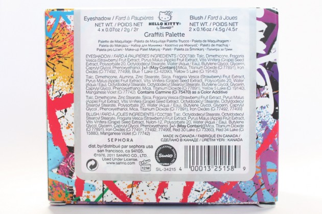
The ingredients
Hello Kitty Graffiti Palette ingredients & packaging label
A few extra pictures
(Because honestly, I don’t have any self-control whatsoever. And also, I really liked this palette.)
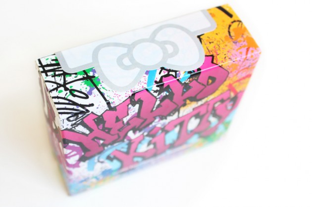
Hello Kitty Graffiti Palette – box
Hello Kitty Graffiti Palette – packaging
Hello Kitty Graffiti Palette
Hello Kitty Graffiti Palette – eyeshadow swatches; different lighting. Possibly a combination of indirect sunlight and flash? Yeah, let’s go with that.
Hello Kitty Graffiti Palette – eyeshadows
Hello Kitty Graffiti Palette – blushers
