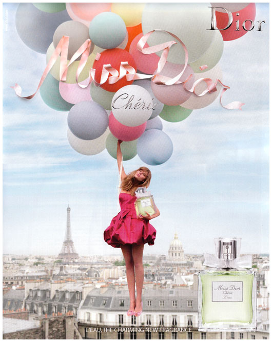
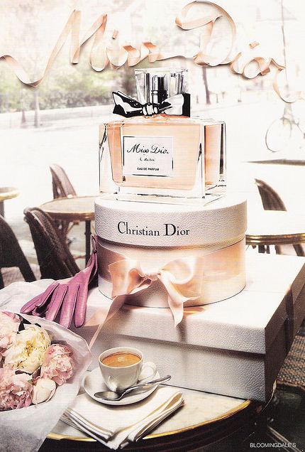
Am I the only one that is hugely disappointed by the new Miss Dior Cherie ad? I mean… it’s not a bad photo, per se, but I just–
Okay, let’s be totally honest. I hate it. I hate that it’s not the old ad; I hate that the gorgeous Natalie Portman looks a fair bit unlike herself; I hate that they felt the need to add “artistic suggested nudity.” I hate that the damn bottle is off-center!
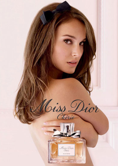
The ad is boring, Dior. It’s mainly innoffensive, and yes, (dare I say it?) it’s pretty… but it’s BORING. I like the two-page ad a bit more, but still: this just doesn’t have the appeal that the previous campaign had. Bring back the fun, playful version, with Maryna Linchuk! That Miss Dior Cherie campaign has been a favourite of mine since it started running; I even wrote a full post about it last year. (An entire post, dedicated simply to great advertising! Yes, it was that good.) Why attempt to fix it if it wasn’t broken to begin with?
A moment to reminisce:
And a one more Miss Dior Cherie ad that didn’t quite “hit the spot” for me: via
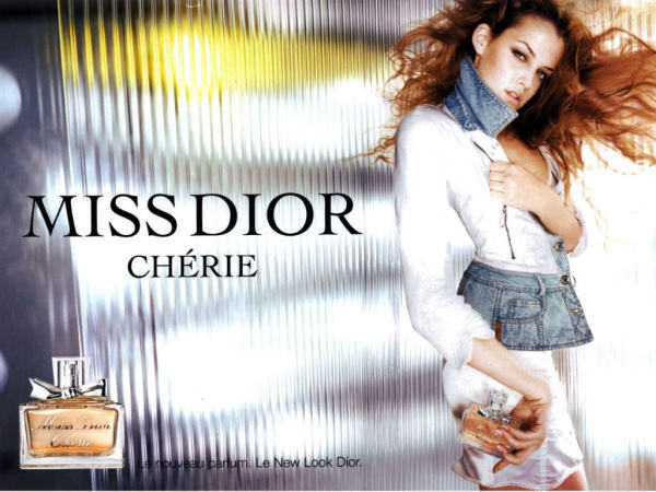
I did love this one, though: via
