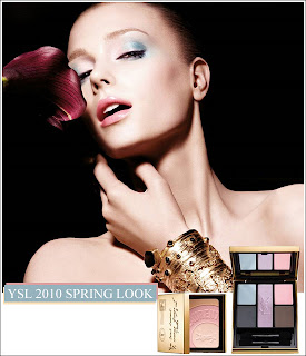
Here are three Spring 2010 collections with god-awful promo images. I mean, they all had very good (and very visible) intentions, but they were just… very poorly executed, if you ask me.
Dior, Clarins, and YSL respectively. Opinions?

And, finally, Shu Uemura’s Egerie collection. I can’t decide if I totally love or totally hate this — for now, it just confuses me. Are you fierce (the shadow, hair, shirt, nails,) whimsical (the colours, glistening bits,) or girly (pastel shadows, light colours)?
I mean, I definitely liked that they’re being risky and mixing all of the above. I just can’t decide if they suceeded, or if they mixed and failed miserably!
