


In today’s smartphone-armed world, readership numbers for non-computer devices are going up, up, up. As a blogger, I feel a certain amount of pressure to put together a mobile theme for theNotice; as a reader, however, I really don’t want to.
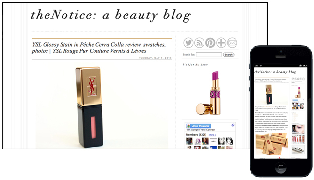
Have you ever noticed… that if you read theNotice on your phone, the striped background automatically gets cut off? And, if you double-tap the body text (which is also the same width as the images), the text is still totally readable?
Yeah. Designed with
meyou in mind.
I get the feeling that I’m the exception rather than the norm on this one, but here are a few of the things I love (and hate!) about mobile sites and responsive themes.
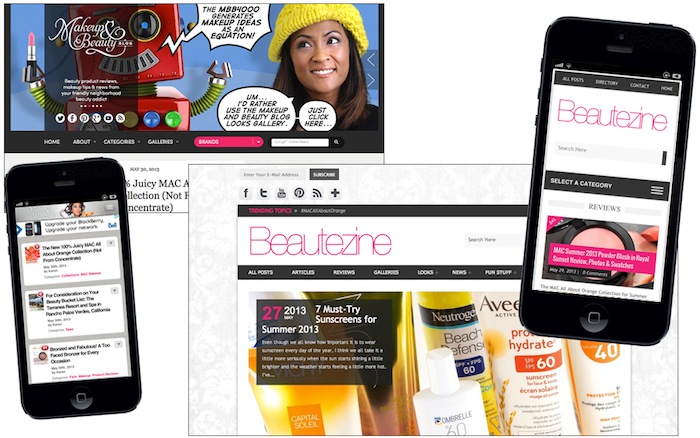
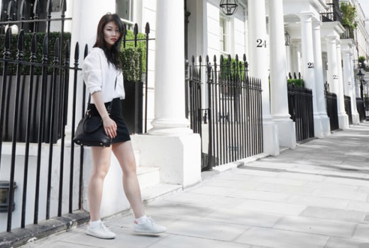
Makeup and Beauty Blog vs Beautezine: two great beauty blogs with very different responsive themes
Responsive Themes
Responsive themes (which are much, much more common for independently-run blogs) display the same content as the desktop site, but switch over to a different layout depending on what kind of device you’re viewing it from. I have a lot (too many!) thoughts on them, so I’ll leave you to a bit of point-form:
The pros
- Faster load time
- Better text scaling
- Single-column
- Homepages typically load only the title & featured image of a post
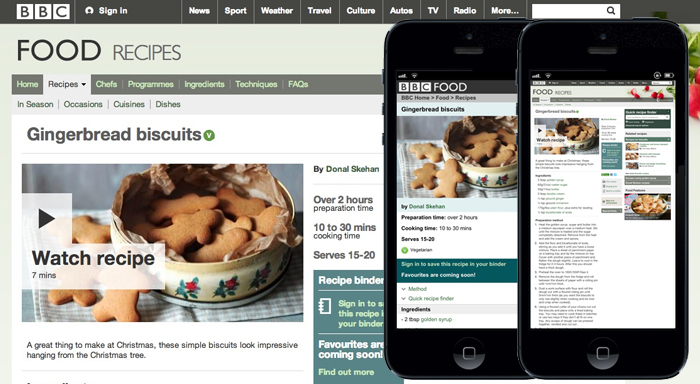
A cross-platform example of a recipe from the BBC’s Food section: Gingerbread Biscuits on a desktop site, a mobile site, and a desktop site as viewed on a mobile device.
The cons
- Sites can get “stuck” on one theme
- No zooming in on those tiny images!
- Default themes are boring and (let’s admit it, they totally are) kind of unsightly
- Square ads take up a lot of your screen real estate
- “Sticky” banner ads frequently glitch when scrolling
- Single-column layout pushes sidebars, search bars, and widgets to the bottom
- Swipe-happy themes often interpret scrolling as a desire to go forward/back a post… or maybe that’s just me and my short thumbs.
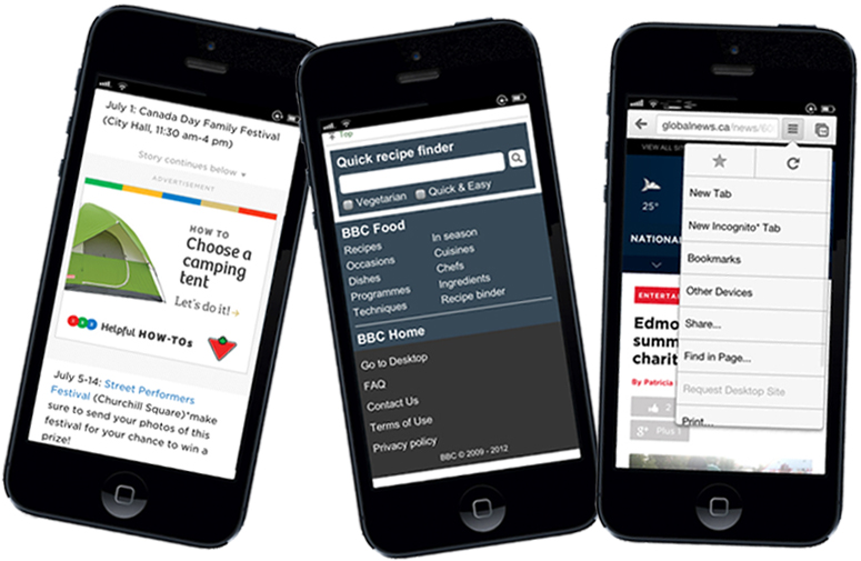
Awkward ads, bottom-of-the-page search bars, and stuck-on-mobile sites
Mobile Sites
Unlike a responsive layout, a mobile site is separate from a web version — meaning that, for a blog, you’ll often not see recent material until the mobile site gets updated, too.
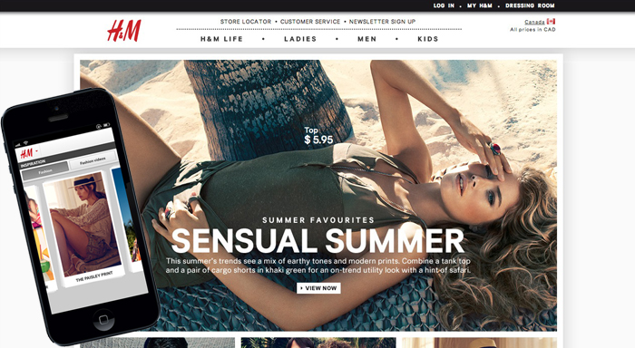
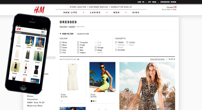
H&M’s desktop vs. mobile sites
From a blogger’s perspective, this sometimes becomes an issue with things like affiliate networks (Nordstrom, for instance, only started giving bloggers the opportunity to earn commission through the mobile site this week), but I personally find it to be more of an issue from a reader’s standpoint
I want to be able to access the same content no matter what I happen to be reading on, and even if a mobile site is faster and more screen-size-appropriate, it doesn’t make up for that annoying “this content is not currently available on the mobile site” page. Now, that’s not to say that mobile apps aren’t a great option to have, but nothing irks me more than a mobile-to-desktop redirect that pushes me to the homepage.
Nothing! Except maybe a US-to-Canada redirect that pushes me to the homepage.
But featuring the same catalogue!
What a Girl Wants
Surprisingly, it has nothing to do with Amanda Bynes or Sandra Dee. All I’m asking for here is a little (functional!) switch to desktop / switch to mobile button on both versions of a site.
Is that really so much to ask for?

So, what’s your take?
Do you love mobile themes, or do you hate them? Is there a mobile site that you think is stellar? Let me know in the comments — I would love to hear your thoughts!